Tutorial
Colour from the ground up: one brand colour into a whole system
Most teams pick a handful of hex values by hand and hope they hold together. The long version: turning one brand colour into a full palette with OKLCH, light curves, smart hue correction, colour harmony, and a clear line between brand and status colour.
Most colour systems start the same way. Someone picks a brand colour, then eyeballs a lighter version for backgrounds and a darker one for text. It looks fine in the file it was made in. Then dark mode arrives, the greys turn muddy, the one bright accent goes neon, a crisp blue falls flat beside a washed-out yellow, and three not-quite-matching greens fight across the same screen. Nothing is wrong, exactly. It just does not hold together, and nobody can say why.
TL;DR
- Work in OKLCH, not HEX or HSL: it splits a colour into perceived lightness, chroma and hue, so the numbers match your eyes.
- Generate a full scale from one source colour with a light curve, instead of hand-picking ten values.
- Let chroma rise and fall across the scale, and correct each step for how we see colour and for what a screen can actually show.
- Find secondary and accent colours by rotating the primary's hue, and tint your neutrals from the brand rather than using flat grey.
- Keep status colours on fixed hues, separate from your brand: your brand green is not your success green.
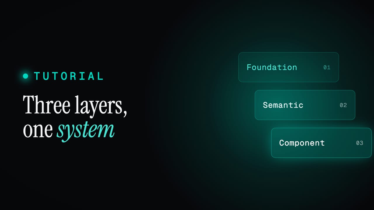
What this covers
- Work in OKLCH
- One colour becomes a scale
- Light curves
- Chroma has its own shape
- Smart hue correction
- Harmony: your other colours
- Neutrals are not just grey
- Brand colour vs status colour
- From raw colour to role
- Tips for a system that lasts
Work in OKLCH
HEX and RGB describe how a screen emits light, not how you see it. #3b82f6 tells a monitor how much red, green and blue to fire; it says nothing about how light or how colourful the result looks. HSL is friendlier, but it lies in a way that matters for scales: it treats every hue at fifty per cent lightness as equally bright. It is not. A pure yellow there is glaring, a pure blue is dim. Build a scale on that assumption and every hue drifts differently.
OKLCH is built for the job. It describes a colour with three values that match how vision works: L, perceived lightness from 0 to 1; C, chroma, how colourful it is; and H, hue, an angle from 0 to 360 degrees. It is perceptually uniform, so equal numeric steps look like equal visual steps, and two colours with the same L look about equally bright whatever their hue. That is the whole foundation for a coherent scale: hold lightness steady and the family stays level; move it predictably and the family moves with it.
#3b82f6                      /* hex: a screen instruction */
rgba(59, 130, 246, 1)        /* rgb: the same three channels */
oklch(0.62 0.19 256)         /* oklch: L 0.62, chroma 0.19, hue 256 */
You do not have to think in OKLCH to use it. Type a colour as HEX, RGBA, HCL or OKLCH, or paste the brand value you were handed, and it is converted to OKLCH for every calculation that follows. The docs cover choosing a colour format and why the resolved value is stored as hex. The point is not the notation. It is that once a colour lives in a perceptual space, you can do honest arithmetic on its lightness, chroma and hue, and trust that the numbers and your eyes agree.
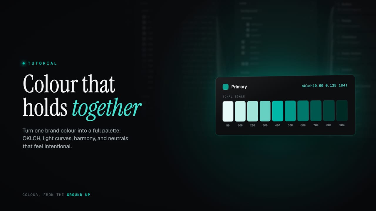
One colour becomes a scale
A brand colour on its own is not a palette. A palette is a tonal scale: the same colour at a run of lightnesses, from a pale tint you can lay text on to a deep shade you can set as text. The convention most modern systems share names the steps in hundreds, 50 at the lightest down to 900 at the darkest. Each has a job. 50 and 100 are for backgrounds and subtle fills. The middle, 400 to 600, is for confident, saturated colour, the part you reach for on a button or a link. 700 to 900 is for text and strong outlines that need to hold.
Ten steps is the default for a coloured palette. Neutrals get more, for a reason we will come back to: the standard neutral scale runs to fourteen and can extend towards thirty. The key move is that you choose the source colour, its hue carries through, and the rest of the scale is generated rather than picked. You are not deciding ten colours. You are deciding one, and the rules the other nine follow.
Light curves
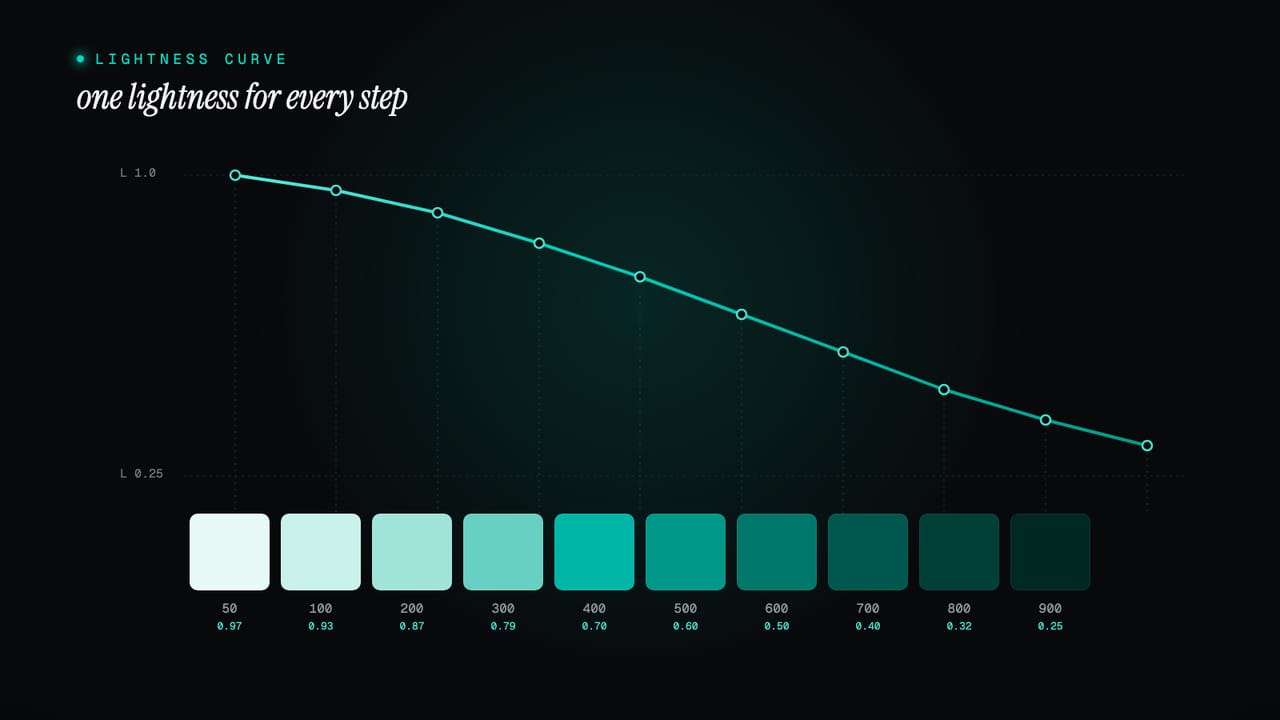
If a scale runs light to dark, something has to decide exactly how light each step is. That is the light curve, and its shape is the biggest single lever on how a palette feels. A linear curve drops lightness in equal numeric steps, even and predictable. An eased curve packs the steps closer at the pale end and spreads them as they darken, which matches how we read tone and stops the light tints collapsing into each other.
The default runs from 0.97 at step 50 to 0.25 at 900, easing as it goes: it gives up lightness slowly at first, then faster.
step    lightness (L)
 50       0.97
100       0.93
200       0.87
300       0.79
400       0.70
500       0.60
600       0.50
700       0.40
800       0.32
900       0.25
You never set those numbers by hand. The editor gives you a dropdown of curve presets drawn from the same easing functions you find in motion design, linear, ease, cubic, exponential, circular and sine, each in its in, out and in-out form. Pick one and every coloured scale in the system takes that shape at once. An ease-in curve keeps the palette light for longer then drops away; an ease-out curve darkens early and levels off. The default is a considered starting point, not a cage.
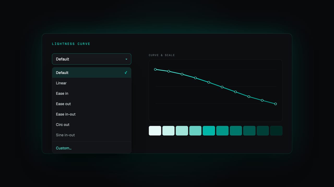
When no preset is quite right, switch to custom and move the control points directly, shaping the lightness step by step and watching the scale update as you go. You get a sensible default the moment you start and full control the moment you need it. The curve is global by default, so the whole system shares one rhythm and feels of a piece, and any single palette can detach its own when it genuinely needs to behave differently. The docs walk through palette curves and lightness and where to reshape the curve.
One rule holds whichever route you take: a lightness curve only ever goes down. Step 100 is always lighter than 200, all the way to 900, so the step number always tells you the tone. The interpolation guarantees the curve never overshoots and reverses, and the circular presets in particular are kept strictly monotonic, so you get an expressive shape with the order preserved.
Chroma has its own shape
Lightness is only half of it. Chroma, the colourfulness, needs its own treatment, and the mistake is to hold it flat. Constant chroma makes your 50 tint a fluorescent wash and your 900 shade a saturated bruise. Good scales follow a bell instead: chroma starts low at the pale end, peaks around the 400 step where colour is most confident, then tapers into the dark. The pale tints stay quiet enough to sit behind text; the dark shades stay rich without turning to mud.
Because chroma rises and then falls, it cannot use the same interpolation as lightness; it uses one that can describe that hump. And because the right amount of colour is a matter of brand, the whole curve sits behind a single intensity control: turn it down for something muted and editorial, up for something vivid and playful. The shape stays the same, the volume changes.
Smart hue correction
This is where hand-built palettes usually come undone. Two problems sit between a tidy set of numbers and a scale that actually looks right, and both are predictable enough to correct automatically.
First, we do not see all hues as equally bright at the same lightness. A yellow looks lighter than a blue even when OKLCH says they match, an effect known as Helmholtz-Kohlrausch. Left alone, yellow scales float too light and blue scales feel heavy. The fix is a small per-hue lightness nudge, strongest through the middle of the scale where the eye is most sensitive and fading to nothing at the extremes, where pure white and near-black leave no room to move.
Second, the screen. A display cannot show every colour the maths can describe. There is room for a bright, saturated yellow, but a bright, saturated blue simply does not exist in the sRGB gamut; ask for it and you get a clipped approximation that breaks the smoothness of the scale. So before a step is committed, its chroma is checked against the most saturated version of that hue and lightness the screen can actually show, and clamped to fit. Every step stays a real, reachable colour. Together, the two corrections make a scale for any hue, an awkward chartreuse as readily as a safe navy, come out evenly tuned, as if someone had balanced it by hand.
Harmony: your other colours
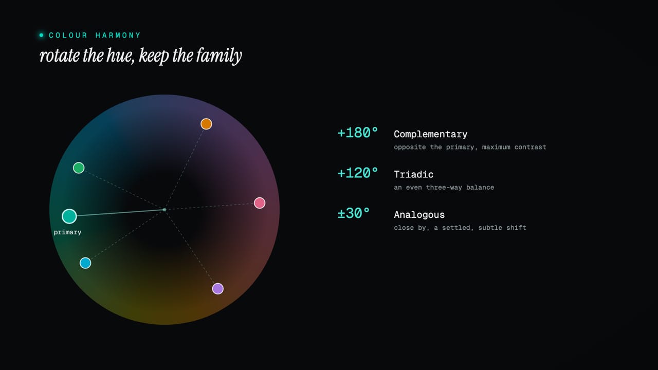
A primary usually arrives alone. A working system needs more: a secondary for support, an accent for emphasis, sometimes a third beyond that. Choosing those by eye is where palettes most often go wrong, because a second colour that genuinely sits well against the first is hard to find. Colour theory solved this long ago, and with a hue angle it becomes simple arithmetic.
Take the primary's hue and rotate it. A complementary colour sits directly opposite, 180 degrees away, for maximum contrast. A split-complementary pair sits either side of that, near 150 and 210 degrees, for softer contrast. A triadic set is spaced evenly in thirds, 120 and 240 degrees apart. An analogous colour sits close by, around 30 degrees, for a subtle, settled shift. Doing the rotation in OKLCH is what makes it reliable: keep the primary's lightness, ease its chroma down a touch so the support colour does not shout, and move only the hue. The result is a sibling of the first, not a stranger.
primary            H
complementary      H + 180     opposite, maximum contrast
split-comp         H + 150,    softer than complementary
                   H + 210
triadic            H + 120,    even three-way balance
                   H + 240
analogous          H + 30      close, harmonious shift
When a role is missing from your set, the wizard offers exactly these options for it, each as a swatch and a short scale so you can see the relationship before you commit, and you pick the one that fits the brand. It is not inventing a colour out of nowhere. It is doing the geometry, in the right colour space, so the relationship you want is one good colour away rather than an afternoon of nudging a picker.
Neutrals are not just grey
Neutrals carry more of an interface than any brand colour: the backgrounds, the surfaces, the borders, the body text. Pure grey, equal parts red, green and blue, is tempting and lifeless, and it never quite agrees with a coloured brand beside it. The better move is a tinted neutral, a grey carrying a trace of the brand's hue, only a few per cent of chroma, too little to read as colour but enough to feel warm or cool on purpose. Derived from your primary, it keeps the whole interface feeling like one system rather than a brand dropped onto a stock grey.
This is also why neutrals get more steps. Most of an interface's tonal work happens in the greys, so they need finer gradations: at the very light end, where backgrounds and raised surfaces sit a hair apart, and at the dark end, where dark mode needs several closely spaced near-blacks to build depth.
Your brand green is not your success green
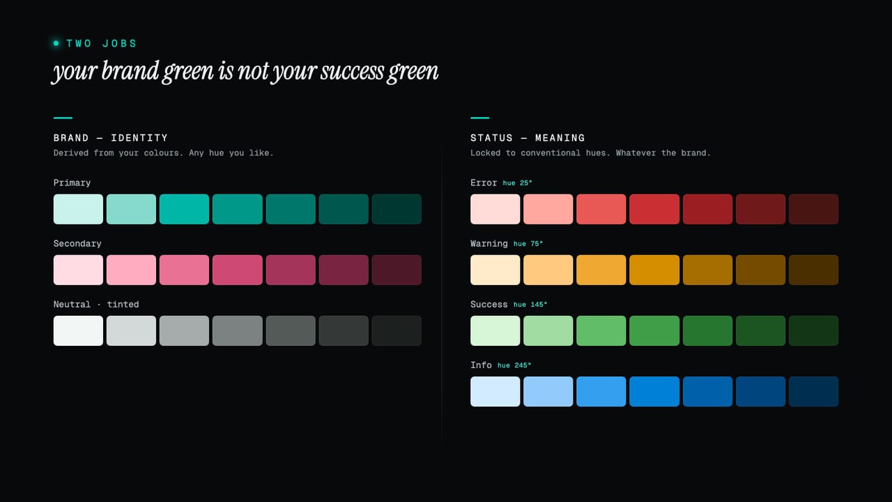
Here is the distinction that catches the most systems out. A brand colour and a status colour do completely different jobs, even when they share a name. Your brand green expresses who you are; it can be any green you like. A success green carries a meaning, and that meaning is a convention older than your product: green confirms, red warns of danger, amber cautions, blue informs. Reuse your brand green for success and you tie a functional signal to a branding decision, so the day the brand shifts, your confirmation messages shift with it. Nobody should have to relearn what green means because you rebranded.
So status colours are treated as their own thing, anchored to fixed, conventional hues rather than derived from your brand. There are four, each a full scale in its own right: an error red, a warning amber, a success green and an information blue. They share the same machinery as every other palette, the same lightness curve, chroma shaping and gamut-safe correction, so they sit visually with the rest of the system, but their hue is held to the signal. You can shift each a few degrees warmer or cooler and tune its intensity to suit the palette, but you cannot turn your success green into your brand green. Their jobs are separate, so they stay separate.
That gives a complete system a clear shape: a small set of brand palettes that say who you are, a tinted neutral doing the quiet heavy lifting, and a fixed set of status colours that carry meaning regardless of the brand. Identity and signal, kept apart on purpose.
From raw colour to role
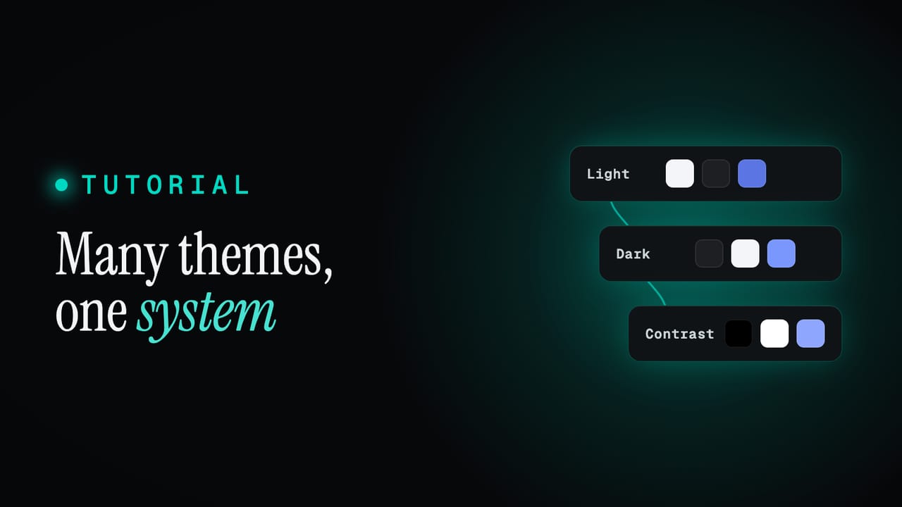
All those scales are raw material, the foundation: indigo.600, slate.100, success-green.700, real values whether or not anything uses them. What turns raw colour into a usable system is a second layer that names colour by its role rather than its value. A semantic token like text.default or border.interactive does not hold a colour; it points at a foundation step, and it can point at a different step in each theme.
That indirection makes the hard things easy. Dark mode is not a second palette you maintain by hand; it is the same roles pointing at the other end of the same scales, text.default reaching for a near-black step in light theme and a near-white one in dark. A rebrand is not a find-and-replace across the product; it is a new source colour regenerating the foundation, with every role inheriting the change because it only ever referred to a step by name. Design and build against roles, let the roles resolve to values, and the values are free to change underneath without anything downstream having to know. That single-edit ripple is covered under how one change cascades in the docs, and the full layer model in the three token layers guide.
Tips for a system that lasts
- Choose colours in a perceptual space. Pick and compare in OKLCH, not HEX or HSL, so the numbers you reason about match what you see. Everything else gets easier once lightness means lightness.
- Generate scales, do not hand-pick them. Decide the source colour and the rules, the curve and the chroma shape, and let the steps follow. Ten consistent steps beat ten separate decisions.
- Let one neutral carry the interface. Tint it from the brand, give it plenty of steps, and use it for most surfaces, borders and text. Save saturated colour for the moments that earn it.
- Reserve the saturated middle for action. The
400to600band is your loudest colour. If everything uses it, nothing stands out; spend it on the one thing you want a person to do. - Keep status meaning conventional. Red, amber, green and blue carry signals people already understand. Hold them apart from your brand colours so a rebrand never changes what a confirmation looks like.
- Judge colours in context. An even scale is not the same as text that reads cleanly on a tinted surface. Check the real pairs in a real layout, not swatch against swatch.
- Pick steps by role, not by feel. Decide that text is the
700step and interactive borders are the600, then apply it everywhere. Consistency in which step does which job is most of what makes a system feel designed. - Model the relationship once. Define how colours relate, by curve, by harmony, by role, so the system stays coherent on its own instead of relying on you to remember every decision.
Colour is a system, not a swatch
The shift that makes colour manageable is to stop choosing values and start defining relationships. A source colour and a curve give you a coherent scale. A hue rotation gives you a colour that belongs beside it. A trace of tint gives a neutral intent. A fixed hue keeps a signal a signal. And a semantic layer lets all of it change underneath your product without breaking anything. Define the relationships once and the palette stays honest while you get on with everything else.
All of this ships wired up in every Zaklad project: point a new project at a single brand colour and you get the full set of scales, the tinted neutral, the harmonious companions and the fixed status colours, generated and ready to retune. Start a project and open the colour editor, read the colour and theming docs for designers, or see what else the platform does on the features page.