Tutorial
Themes and modes: build as many as you like, maintain one system
Light, dark, high contrast, a brand variant. Most teams keep each theme as a separate copy that quietly drifts. Zaklad models themes as one system whose variants inherit from each other, so each theme holds only what makes it different. Here is how semantic tokens carry the theme, how the inheritance works, how to switch and add themes, and what a theme becomes in Figma and in code.
Most products run more than one theme. A light one and a dark one at least, often a high-contrast pass for accessibility, sometimes a tinted variant for a sub-brand or a marketing surface. The trouble is how they are usually built: each theme is a separate copy of the colours, maintained by hand. Change a brand blue and you change it in every theme and hope you caught them all. Add a colour and you have to remember to give it a value in dark, in high contrast, everywhere. For a design lead that is a rebrand that never quite finishes. For whoever owns the tokens, it is the same edit done three or four times, with all the drift that invites.
Zaklad treats themes as one system with several faces, not several systems running in parallel. Every project ships with Light and Dark wired up from the first day, you add as many more as you need, and the themes inherit from one another so each one stores only what makes it different. This guide covers how semantic tokens carry the theme, how that inheritance model works, how to switch and add themes in the editor, and what a theme becomes once it lands in Figma and in your generated code. You can follow most of it without an account, though by the end you may want to point a project at your own brand and watch it.
Semantic tokens: the layer that carries the theme
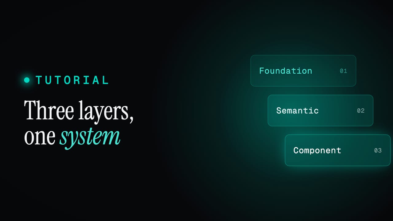
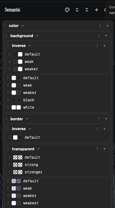
Themes only make sense once semantic tokens do, so start there. Tokens in Zaklad live in three layers. Foundation is the raw material: the actual palette, the real colours, the dimension and type scales. Semantic names that material by role, like color.text.default, color.surface.default, color.border.default or color.container.primary.default. Component maps those roles onto specific parts.
Here is the part that makes theming work. A semantic colour token does not hold a colour. It holds a reference to a foundation colour, and which foundation colour it points at is decided per theme. In Light, color.text.default points at a near-black step in the palette; in Dark, the very same role points at a near-white one. The role stays constant, what it resolves to changes with the theme. A component asks for color.text.default and never has to know which theme is active.
That is the whole mechanism, and it is why a theme is colour and nothing else. You are not redrawing your palette for dark mode, you are repointing a fixed set of roles at the one shared palette. Spacing, type and sizing have semantic tokens too, but each points at a single foundation value and never varies by theme, so they sit outside theming entirely. Because every component is built on semantic roles rather than raw colours, anything you build themes automatically, in every theme you have, the moment it exists.
It is worth seeing the resolved values side by side, because this is what every downstream tool eventually receives. Each role lands on a real colour in each theme, and the role name is the thing that stays constant:
                                 Light       Dark
color.text.default               #1D1F23     #F3F5F8
color.container.primary.default  #5B76E2     #7A97FD
color.border.default             #B5BBC2     #5E646B
Themes, modes, and what to call them
One word, three houses. In the editor, the thing you build is a theme, and that is the word the product uses. When it lands in Figma it becomes a mode on a variable collection, because mode is Figma's word for the same idea. When it lands in code it becomes a named theme you select on the provider. It is the same construct throughout, so if you have been told a design tool wants modes and your developer talks about themes, they are describing one thing from two sides. Zaklad is the bit in the middle that keeps the two in step.
The inheritance model
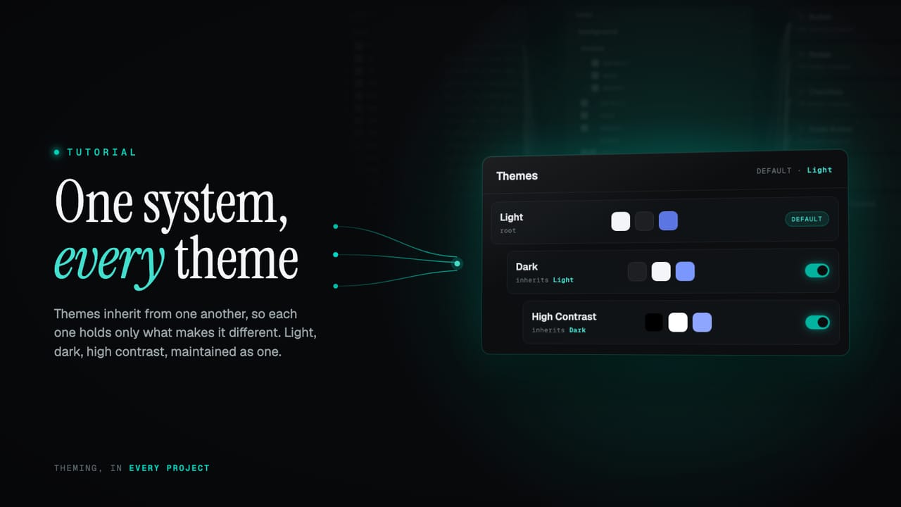
This is the part worth slowing down for. Themes are arranged in a tree. Light is the root and the default. Dark is created as a child of Light. A child theme inherits every semantic colour from its parent, and overrides only the ones that should differ. Dark does not restate the whole palette mapping, it says "text is light here, surfaces are dark here" and lets everything it has no opinion about fall through from Light.
You can fork again from any theme, as deep as you like. A High Contrast theme can inherit from Dark, override the two or three colours that need to be harsher, and pick up the rest of Dark unchanged. The chain holds the relationships so you do not have to.
Light          (root, default)    color.text.default              -> slate.900
                                  color.container.primary.default -> indigo.500

Dark           (inherits Light)   color.text.default              -> slate.50    (override)
                                  color.container.primary.default -> indigo.400   (override)

High Contrast  (inherits Dark)    color.text.default              -> slate.0     (override)
                                  color.container.primary.default -> (inherited from Dark)
Resolving a colour is then a simple walk. Ask a theme for color.text.default: if it has its own override, use it. If it does not, ask its parent. Keep walking up the chain until a value is found, and if nothing along the way has overridden it, fall back to the role's own default. Override wins, otherwise inherit. It is recursive, it is linear, and there are no precedence surprises to keep in your head.
Now follow what that buys you. Foundation is shared, so the palette has one home. Change slate.900 once and every theme that resolves a role to it updates at once, in the editor, in Figma, in code, no sweep required. Because a derived theme stores only its differences, a new variant is a handful of overrides rather than a full copy of the system. And a deep chain means a specialised theme like High Contrast tracks its parent automatically: adjust Dark and High Contrast moves with it, except for the few colours it has deliberately pinned.
Model the difference once, inherit the rest. A new theme is the few colours that change, not a copy of everything that does not.
The point of theme inheritance
Switching themes in the editor
You work on all of your themes in one place. In the semantic column, the header carries a small view switcher: All themes, then one entry per theme, Light, Dark, and any you have added. It is how you change which theme you are looking at, without leaving the editor or losing your place.
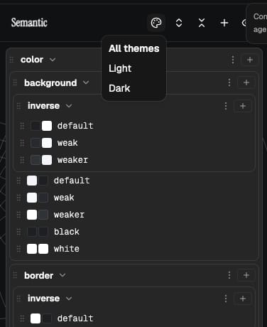
All themes lays every theme's resolved colour side by side for each role, so you can read a row like color.text.default across Light and Dark together and check the pair makes sense. Pick a single theme and the column focuses on it, showing exactly what that theme resolves to and letting you set its overrides. Switching the view never changes anything, it just changes what you are looking at.
Changing a colour for a theme means repointing a role at a different foundation step, in that theme only. Adjust color.surface.default while viewing Dark and you have changed Dark alone. Light keeps its own value, and any child of Dark that has not overridden that role follows the change automatically. It is the inheritance model from the section above, expressed as something you click rather than something you have to picture.
Adding and enabling a theme
New themes live in Settings, Themes, where your themes are laid out with their lineage, each one noting which theme it inherits from. Three controls do the work.
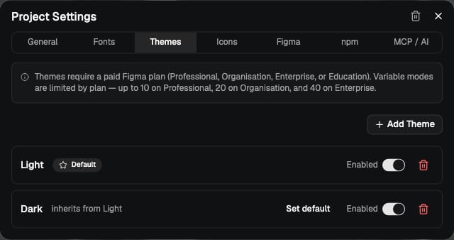
- Add a theme. Give it a name and pick what it inherits from. It starts as an exact copy of that parent, every colour inherited, and you override only the few that should differ. A brand-tinted variant might override two colours and inherit the other thirty.
- Enable or disable. A toggle decides whether a theme ships in your generated code and Figma export. You can build a theme as a draft, see it in the editor, and keep it out of the export until it is ready.
- Set the default. One theme is the default, the one that renders first before anything else is selected. Light is the default to begin with; make any enabled theme the default when you want.
There is one more piece of housekeeping the system does for you. When you add a new semantic colour to the project, it is seeded into your themes and flagged for review, so a colour you introduced for light is never silently left undefined in dark. The flag is a prompt: decide what this role should be in each theme before you ship. It is the difference between a theme that is complete by construction and one you discover gaps in later.
What a theme becomes in Figma
Push to Figma and the structure maps cleanly. Your tokens arrive as Figma variables, grouped into collections. Foundation is its own collection with a single set of values, the shared palette and scale. The semantic colour layer becomes a collection with one mode per enabled theme: a Light mode, a Dark mode, a High Contrast mode, named exactly as your themes are.
Inside that collection, each semantic variable points at a foundation variable as an alias, per mode. color.text.default aliases the dark-text swatch in the Light mode and the light-text swatch in the Dark mode. Flip the mode on a frame and every variable bound to a semantic colour reflows to the other theme, because they are aliases to the shared palette rather than copies of it. That is the same inheritance idea expressed in Figma's own machinery: one palette, many modes resolving against it. Your designers switch a mode and see the real thing, built from the same source the developers will.
What a theme becomes in code
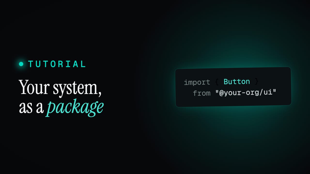
In your generated package you do not handle any of this by hand. You import your tokens and use them, and the system resolves the right value for whichever theme is active. Everything comes from a single tokens export: destructure what you need and apply it directly to any element.
import { tokens } from "@your-org/ui"

const { color, spacing } = tokens

function PriceTag() {
  return (
    <span style={{
      color: color.text.default,
      padding: spacing.padding.small,
      borderColor: color.border.default,
    }}>
      €29
    </span>
  )
}
color and spacing are your semantic roles. Each one resolves to a real, ready-to-use value you can drop onto any element, and the colours are reactive: when the active theme changes, everything using them updates, with nothing extra from you. foundation is there too when you want a fixed palette colour that should not move with the theme. The one rule is that these are used inside the provider, which is what makes them theme-aware in the first place. Your IDE autocompletes every path and shows the resolved value as a hint as you type.
To set the active theme, wrap your app in the provider, named after your organisation, and pass a theme from the exported Themes enum. Using the enum rather than a loose string means a wrong or removed theme is caught as you build, not in production. Store it in state to switch at runtime, and the whole tree re-themes at once.
import { useState } from "react"
import { AcmeProvider, Themes } from "@your-org/ui"

export function App() {
  const [theme, setTheme] = useState(Themes.light)

  return (
    <AcmeProvider theme={theme}>
      <button onClick={() => setTheme(theme === Themes.light ? Themes.dark : Themes.light)}>
        Toggle theme
      </button>
      <YourApp />
    </AcmeProvider>
  )
}
Sometimes you want one region in the opposite theme: an inverted callout on a light page, a dark hero band, a preview card that always shows your dark theme. Wrap just that part in the Theme component, set to whichever theme you want, and everything inside it resolves to that theme while the rest of the page is untouched.
import { AcmeProvider, Theme, Themes } from "@your-org/ui"

// The app runs in light; this one panel flips to dark.
<AcmeProvider theme={Themes.light}>
  <Page />

  <Theme name={Themes.dark}>
    <Callout>Inverted panel, dark on a light page</Callout>
  </Theme>
</AcmeProvider>
It nests as deep as you like and stays reactive, so an inverted panel still flips correctly when the surrounding app moves between light and dark. The same tokens, the same components, just resolved against the theme you scoped them to. The full developer guide, including provider setup and using tokens directly, is in the docs.
Why this stays easy to maintain
Pull the threads together and the maintenance story is the whole point of the design:
- One palette, shared. Foundation lives in a single place, so a brand colour is changed once and every theme that uses it follows.
- Themes are roles pointed at the palette. A theme only repoints semantic colour roles; spacing, type and sizing never fork by theme, so themes never multiply that work.
- Derived themes store only differences. A new variant is the handful of colours that change, not a copy of the system, and it tracks its parent for everything else.
- New colours are flagged for review. A role you add is never silently undefined in another theme; the system prompts you to decide it.
- One model, three destinations. The same theme is a mode in Figma and a selectable theme in code, so the editor, the design file and the package never disagree.
That is the difference between themes as a maintenance tax and themes as a feature you can lean on. A design lead can stand up a high-contrast pass or a sub-brand in an afternoon and trust it stays current. A specialist gets a clean foundation, an inheritance tree they can reason about, and an export that resolves to real values. Both are working on one system.
Try it on your own brand
The quickest way to feel this is to fork a theme and watch what moves. Open a project, duplicate Dark into a new High Contrast theme, override a colour or two, and switch between them in the column header. The values that are not yours stay tied to their parent, the ones you changed hold, and the export updates without another edit.
No system yet? Point a new project at a single brand colour and you get a full token system with Light and Dark already wired up and inheriting, ready to add a variant to. Start a project and fork your first theme, read the theme inheritance docs, or see what else the platform does on the features page.