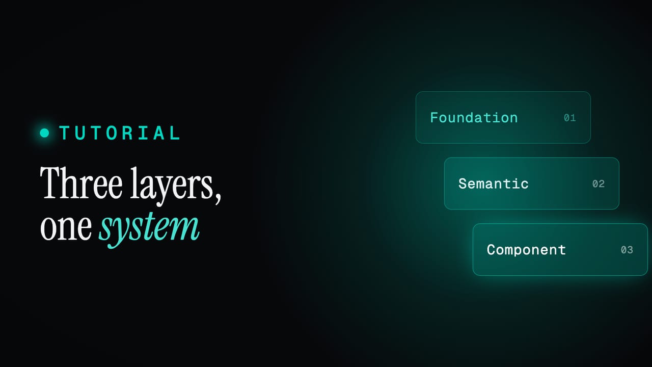
Tutorial
One icon system: many libraries, unified variants, in code and Figma
Icons are where consistency quietly breaks: two libraries with different names, mismatched variants, and a design set that drifts from the coded one. Here is how to pull any number of icon libraries behind one consistent API, unify their variants, and keep code and Figma in step.
Icons are where consistency quietly falls apart. One library calls it chevron-right, another ChevronRightIcon, a third ships only outlined when you need a solid. The designers pull from a Figma set, the developers install an npm package, and the two drift apart within a sprint. None of it is a big problem on its own, and all of it together is why an interface ends up with three subtly different arrows and nobody sure which is correct.
The fix is to stop treating icons as files and start treating them as part of the system. In Zaklad that means any number of libraries can sit behind one consistent set: shared names, unified variants, the same icons in code and in Figma, sized with the same tokens as everything else. This guide covers how that is put together and how to use it.
TL;DR
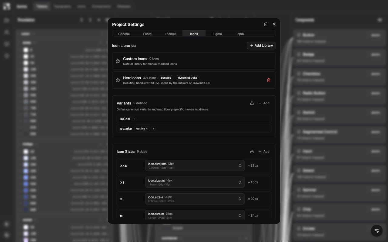
- Install pre-configured libraries (Heroicons, Lucide and others) in a click, or upload your own, and merge as many as you like behind one set.
- Variants are unionised: define canonical variants (solid, stroke, duotone) once and map each library's names onto them, so one variant name works across every source.
- The same icons ship as both code and Figma components, with matching names and variants, so design and build never drift.
- In code, import icons from the
/iconssubpath asIcon.*components; choose a variant and size with props, and only the icons you actually use are bundled. - Icons are sized with tokens, per responsive tier, like the rest of the system.
What this covers
- Many libraries, one set
- Variants, unionised
- The same icons in code and Figma
- Using icons in code
- Sizing icons
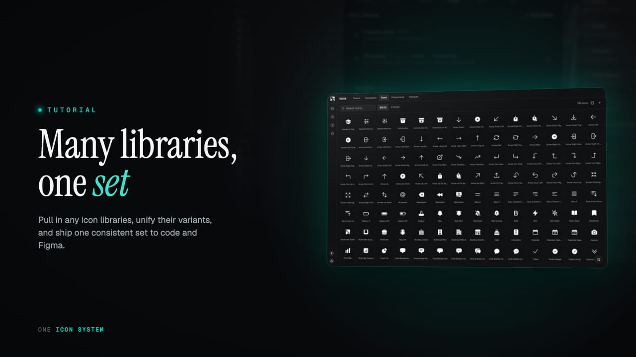
Many libraries, one set
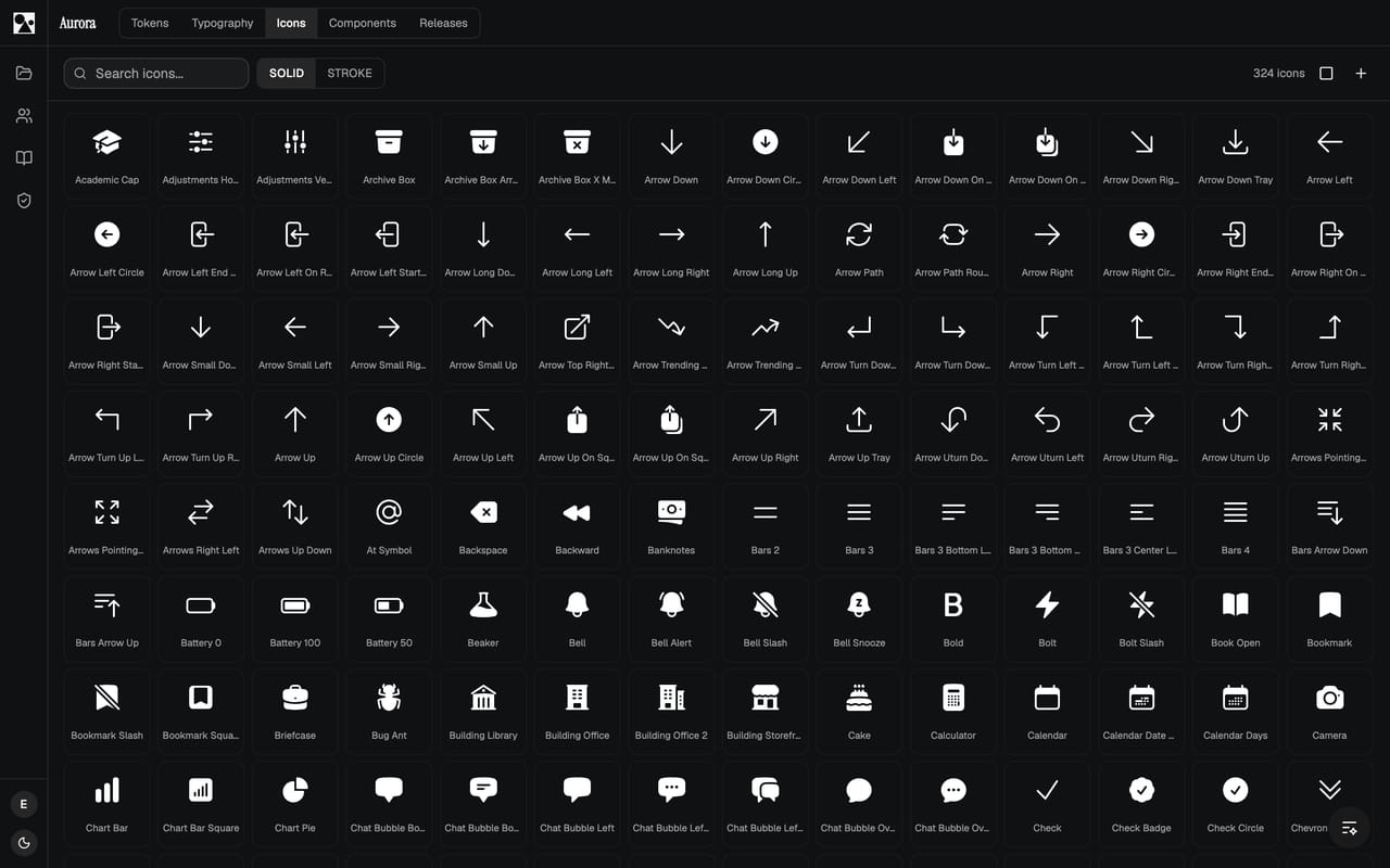
Most teams do not want to draw an icon set from scratch, and they should not have to. You can install a pre-configured library, Heroicons, Lucide and others, in a single click, and it arrives wired into the system: named, categorised and ready to use. If you have your own custom icons, upload them and they join the same set. There is no limit of one. You can pull from several libraries at once, plus your own, and they all live behind a single, searchable set rather than as separate packages a developer has to juggle.
Bringing libraries together is the easy half. The hard half, the part that usually defeats a hand-rolled approach, is making icons from different sources feel like one set rather than a pile of imports. That is what the next two pieces solve.
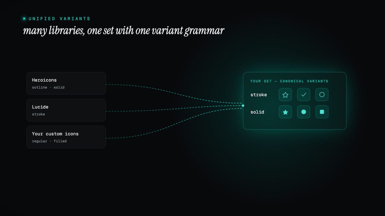
Variants, unionised
Every icon library has its own idea of variants. One offers outline and solid, another stroke and fill, a third adds duotone. Left alone, that inconsistency surfaces everywhere you use them. The system unifies it: you define a set of canonical variants once, then map each library's own names onto them as aliases. A library's outline becomes your stroke; its fill becomes your solid. From then on, one variant name works across every icon, whatever library it came from.
This is the part that is genuinely hard to do by hand and easy to take for granted once it works. Because the variant axis is shared, a designer can flip the whole set from stroke to solid in one move, and a developer can ask for solid on any icon and trust it resolves, without memorising which library used which word. The icons stop being a collection of sources and start being a single set with a consistent grammar.
The same icons in code and Figma
An icon set that only exists in code helps developers and leaves designers guessing; one that only exists in Figma is the reverse. Zaklad ships the set as both: every icon is delivered as a code export and as a Figma component, with the same names and the same variants on each side. A designer placing an icon in a layout and a developer rendering it in a build are reaching for the same thing by the same name. When the set changes, both sides change together, so the design file and the codebase never quietly diverge. What syncs to Figma, icons included, is covered in what gets synced.
Using icons in code
In the generated package, icons live in their own /icons subpath. Import the whole set as Icon and reference each one by name, as its own component. Because these are named exports rather than one big object, your bundler keeps only the icons you actually render, so importing the set costs you nothing for the ones you never use.
import * as Icon from "@your-org/ui/icons";

// Render an icon
<Icon.ArrowRight />

// Choose a variant and size
<Icon.ChevronRight variant={Icon.VARIANT.Solid} size={Icon.SIZE.Large} />

// Pass a specific variant to a component slot
<Button.Primary leadingIcon={Icon.ChevronRight.Solid}>Continue</Button.Primary>
Each icon takes a variant when it has more than one, a size (an Icon.SIZE name or a raw pixel value), and an optional title that makes it readable to screen readers. The unified variant names from earlier carry straight through: Icon.ChevronRight.Solid is the same solid you toggled in the editor, so a component slot can be handed one exact variant.
// Smallest bundle: import a single icon by name
import { ArrowRight } from "@your-org/ui/icons";

// Names known only at runtime (e.g. from a CMS): DynamicIcon
import { DynamicIcon } from "@your-org/ui/icons";
<DynamicIcon name={iconName} size={Icon.SIZE.Medium} />
For names you know ahead of time, import them directly and the bundle stays as small as it can be. For names you only learn at runtime, DynamicIcon looks an icon up by name; it pulls in the whole set, so reach for it only when you have to. Either way the exports are fully typed, an editor autocompletes the names and flags a typo, and the same set renders on web and native. The full API is in the icons documentation.
Sizing icons
Icons are sized the same way as everything else in the system: with tokens, not magic numbers. There is a small scale of icon sizes, and an Icon.SIZE name resolves through it per responsive tier, so an icon sits a touch larger on a wide layout and tighter on a small one with no hard-coded pixel value in a component. Leave the size off and it falls back to the project's base step; pass a raw number only for the rare one-off. Change the scale and every icon that uses it moves in step, rather than as a separate chore.
That is the whole idea: icons treated as a first-class part of the system rather than a bag of files bolted on the side. Pull in the libraries you want, unify their variants, and you get one consistent set in code and in Figma, sized and named like everything else. Start a project and open the icons tab, or read the icons documentation for the full reference.