Tutorial
Type that scales: from one ratio to a full set of text styles
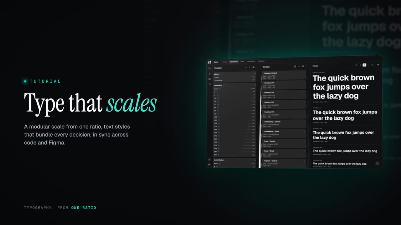
Good typography is not a font choice, it is a system: a scale of sizes that relate, styles that bundle every decision, and one set of names that holds across screen sizes, code and Figma. Here is how to build it from a single ratio.
Most type problems are not font problems. The font is fine; it is everything around it that drifts. A heading here is 28px, a nearly identical one there is 30px, line heights are whatever looked right that afternoon, and by the time the interface is built there are a dozen sizes that were each a one-off decision. It reads as almost-consistent, which is the worst kind, and it is impossible to adjust as a whole because there is no whole, just a list.
Typography that holds together is a system, the same as colour or spacing: a scale of sizes that relate by a rule, styles that bundle every decision into one named thing, and a set of names that stays stable across screen sizes, across code and across Figma. This guide builds that up from a single number, the ratio, and shows how the pieces fit.
TL;DR
- A type scale is built from a ratio: each step is the one below times a constant. Pick a preset (minor third, major third, perfect fourth, golden ratio) in the wizard, and tune how pronounced the scale is.
- Work in text styles, not loose sizes: a style bundles font family, weight, size, line height and letter spacing, each referencing a token.
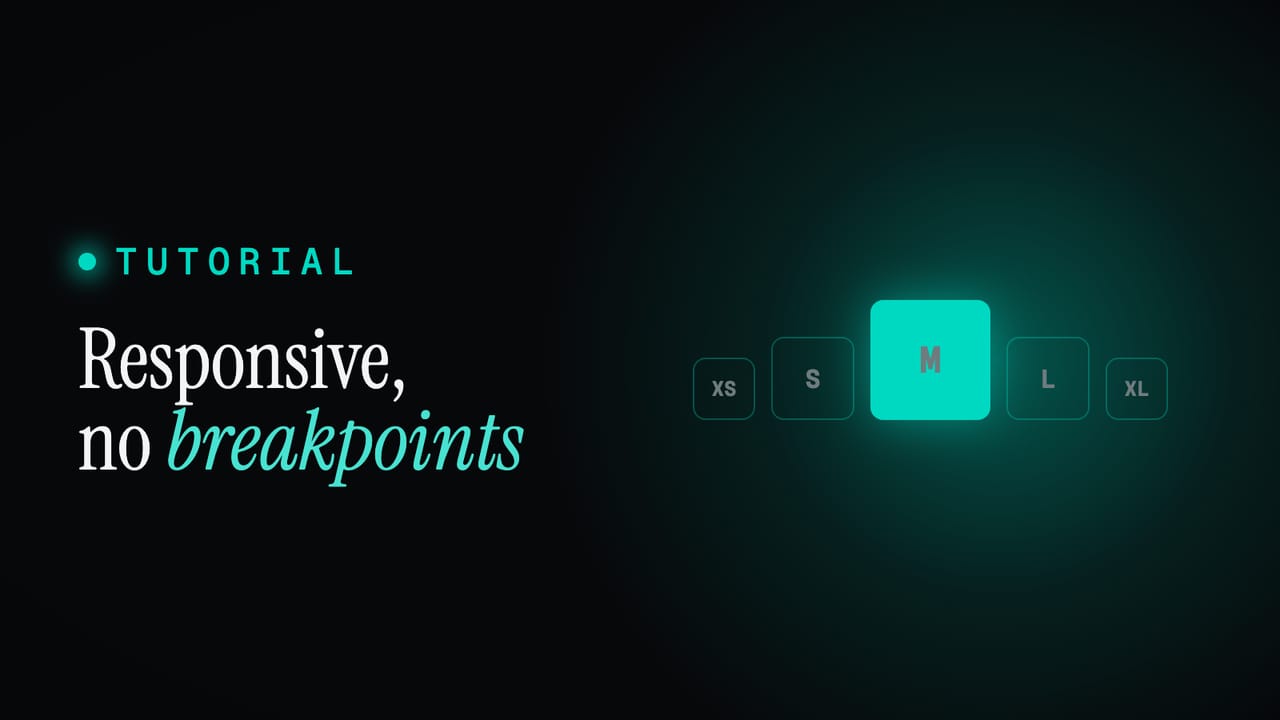
- One style resizes per responsive tier (XS to XL), so the same role is comfortable on a phone and a wide screen without separate styles.
- Text styles ship as both code and Figma text styles, in sync, so the two never drift.
- Fonts are self-hosted and embedded in every release, with an optional global CDN.
What this covers
- Start with a ratio
- Text styles, not loose sizes
- One style, every screen size
- The same styles in code and Figma
- Fonts, handled
Start with a ratio
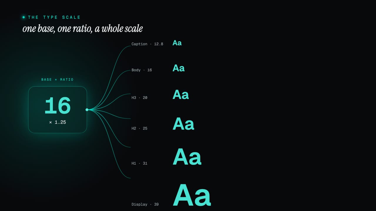
A type scale is the set of sizes your system is allowed to use, and the trick is that they are not chosen one by one. They are generated from a base size and a ratio: each step is the step below it multiplied by the same constant. A ratio of 1.25 turns a 16px base into 20, 25, 31 and up, and 16, 12.8, 10.2 and down. Because every size is a fixed multiple of its neighbour, the scale feels deliberate rather than arbitrary, and there is no room for two headings a stray pixel apart.
You do not calculate any of this. When you set a project up in the wizard, you pick the ratio from a short list of the classic ones and the scale is built for you. The names are the musical intervals these ratios are borrowed from: a minor third is 1.2, a major third 1.25, a perfect fourth 1.333, the golden ratio 1.618. A smaller ratio gives a tight, even scale that suits dense, functional interfaces; a larger one gives dramatic jumps that suit editorial and marketing work.
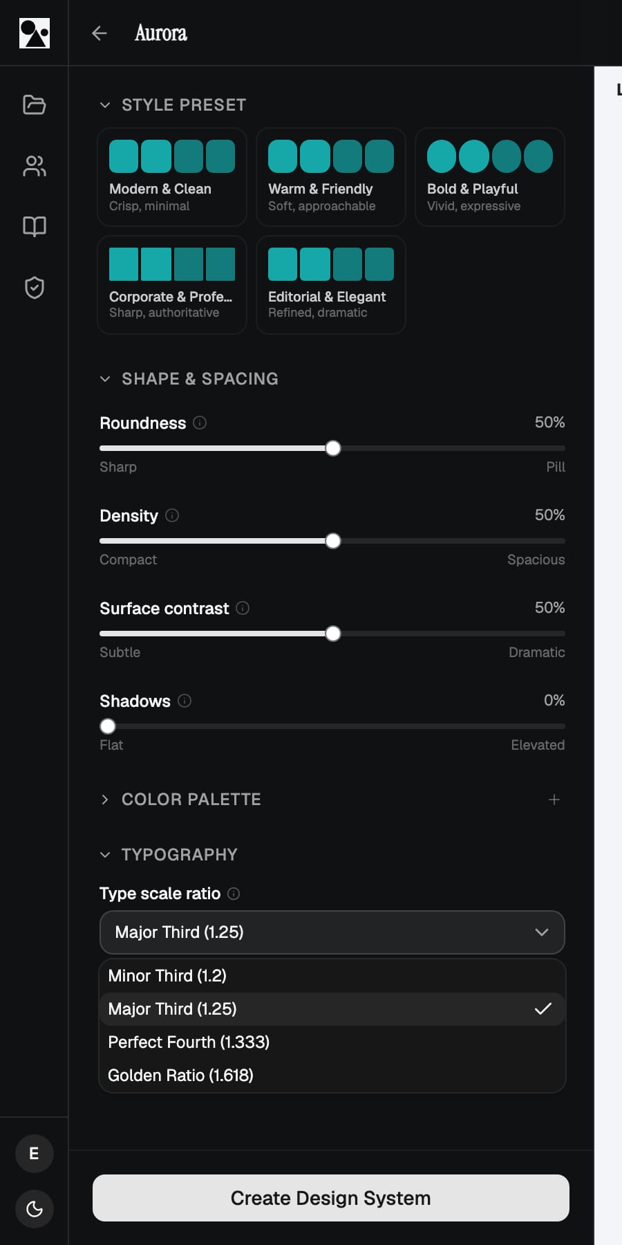
Alongside the ratio sits an expressiveness control, a simple Tight to Dramatic slider. The ratio sets the relationship between adjacent steps; expressiveness sets how far the scale spreads overall, how much bigger your largest display size is than your body text. Two systems can share a ratio and feel completely different because one keeps everything close and the other lets the top end soar. It is the fastest way to dial type from understated to bold without touching a single number.
Text styles, not loose sizes
A size on its own is not a typographic decision. A real one, a heading, a caption, a body paragraph, is a bundle: a font family, a weight, a size, a line height, and often a letter-spacing adjustment, all chosen to work together. Set those individually every time you place text and you are making the same five decisions over and over, slightly differently each time. A text style captures the bundle once, names it, and lets you apply the whole thing as a unit.
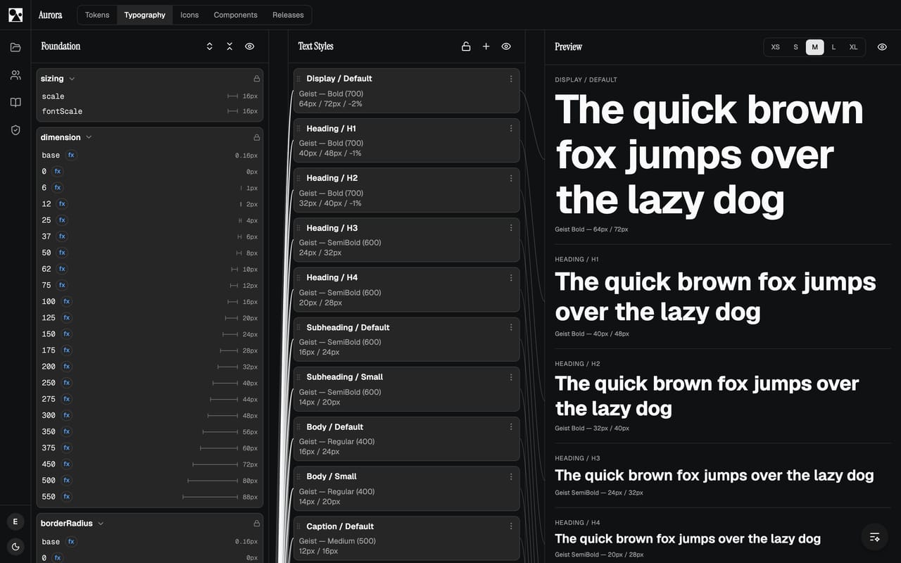
Crucially, a text style does not hold raw numbers either. Each property points at a token: the size is a step on the type scale, the weight is a defined font weight, the line height is its own token. So a style is a set of references, which means it inherits every benefit of the token system. Retune the scale and every style built on it moves with it. The values are read back to you for every platform as you edit, so you are never guessing what 40px becomes elsewhere.
One style, every screen size
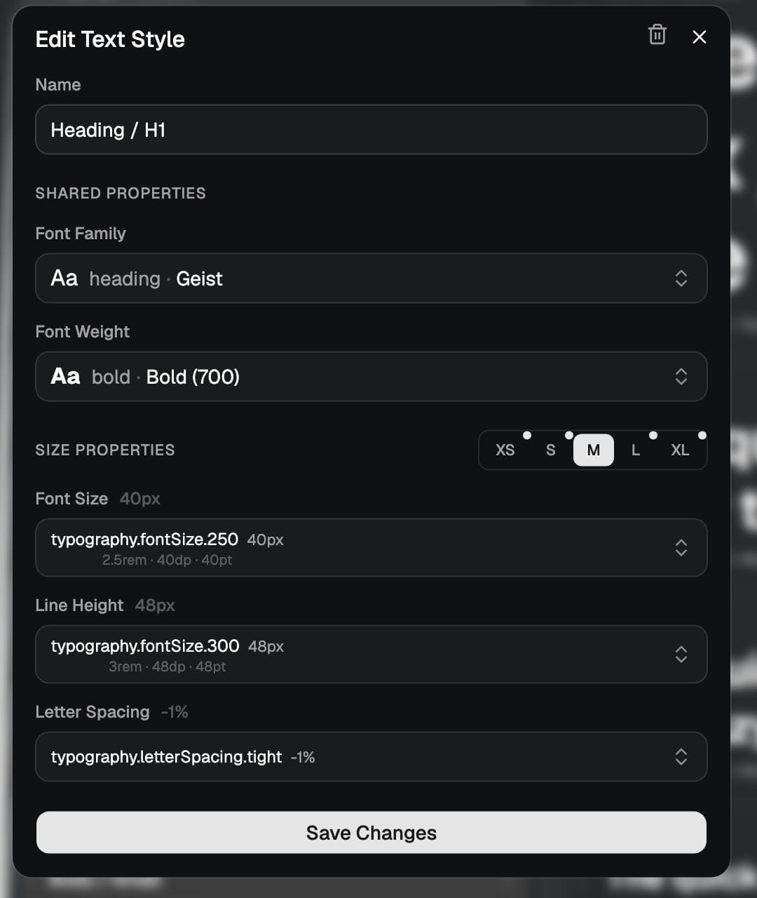
A heading that is right on a wide screen is often too big on a phone, and the usual answer, a separate mobile style or a pile of breakpoint overrides scattered through the code, is exactly the kind of duplication a system should remove. Here a single text style carries a size for each responsive tier, from XS up to XL. The role stays one thing, Heading / H1, and it simply resolves to a smaller size on a narrow tier and a larger one on a wide tier.
Because the tiers are sizing contexts rather than hard pixel breakpoints, the same approach works beyond the web, on native as readily as in a browser. You design and build against the role, and the right size for the context is chosen for you. The thinking behind tiers is in the XS to XL sizing context, with the practical side under breakpoints and cross-platform.
The same styles in code and Figma
A text style is only useful if everyone reaches for the same one. So the styles ship as both code and Figma text styles, with the same names and the same values on each side. A designer applying Heading / H1 in Figma and a developer using the matching style in a build are using the same definition, and when the scale or a style changes, both update together. There is no separate Figma type sheet to maintain alongside the code, and no slow drift between what was designed and what was built. What syncs across is covered in text styles.
Fonts, handled
Underneath the styles are the fonts themselves, and those are handled so you do not have to think about delivery. Fonts are self-hosted and embedded into every release, on every tier, so a built site or app carries its own fonts with no dependency on an outside service and nothing to configure. For teams that want shared, cached delivery across many properties, there is an optional global font CDN. Either way the type in your release is the type you defined, with no third-party loader in the critical path. The delivery details are in the fonts documentation.
Put together, that is a type system rather than a font choice: a scale generated from one ratio, styles that bundle every decision and reference tokens, sizes that adapt per tier, and one set of names shared by code and Figma. Define it once and it stays consistent while you get on with the work. Start a project and open the typography tab, or read the text styles documentation for the full reference.