Tutorial
Consuming the package: install, provider, components, themes, web and native
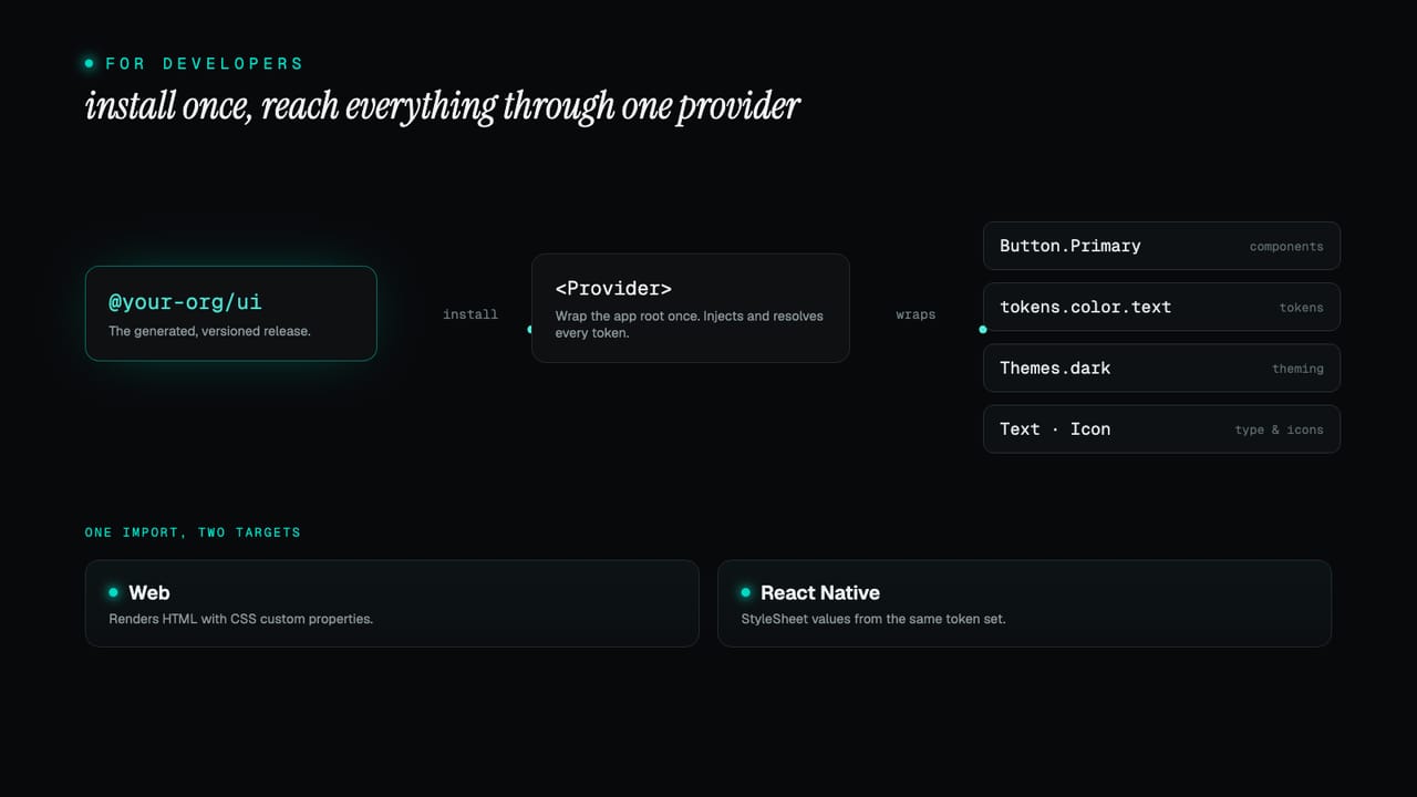
A Zaklad release ships as a generated npm package: one provider to wrap your app, components with a namespaced API your IDE completes for you, tokens you can read directly, compile-checked theme switching, and the same code running on web and React Native. Here is the whole developer onboarding, start to finish.
Most design system handoffs land as a slide deck, a Figma file and a spreadsheet of hex codes, and the developer's job is to translate all of it into code that hopefully matches. A Zaklad release skips the translation. When the system owner publishes, the same snapshot that becomes the Figma library is also generated into a real npm package: typed, themed, tree-shakeable, and built to drop into a React app on web or native. There is nothing to interpret, because the package is the system.
This guide is the developer's side of that, end to end. Install the package, wrap your app in one provider, and from there reach for components, tokens, text styles, icons and themes, all with the types filled in so your editor guides you. Everything below is the standard, generated API; the exact names (your package, your provider, your themes) come from your own project and are spelled out in the README shipped with every release.
TL;DR
- Install the generated package from the command shown in Settings, then wrap your app in the provider once. It injects and resolves every token for you.
- Components are namespaces:
Button.Primaryfor the common case,Button.VARIANTandButton.Propsfor dynamic use and types, all on the one import. - Tokens are exported directly: semantic
colorandspacingresolve to live CSS variables,foundationgives you the raw, theme-invariant values. - Themes are a compile-checked enum. Pass one to the provider, switch at runtime, or wrap a region in
<Theme>to pin it. - One codebase, web and native. The same component API and token set run on React and React Native, with no per-platform imports in your app.
What this covers
- Install
- Wrap your app in the provider
- Components are namespaces
- Tokens, directly
- Switching themes
- Text and icons
- The same code, web and native
Install
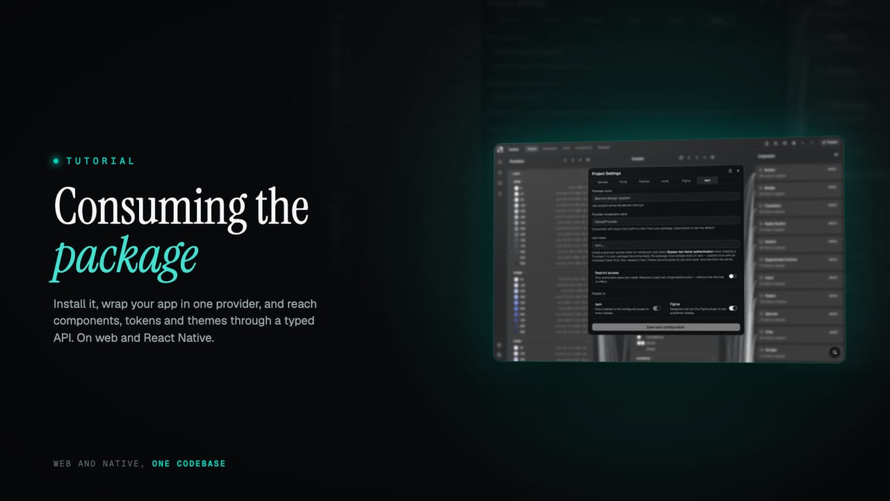
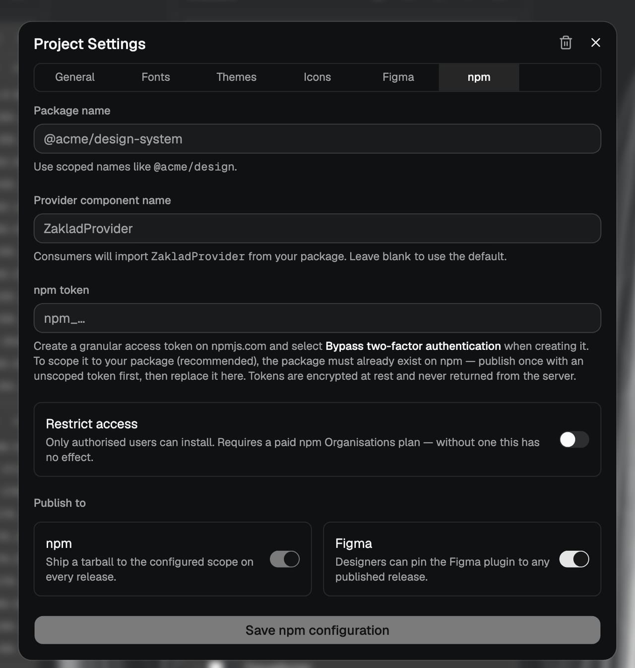
Your package is available the moment a release is published. The install command and the exact package name are in Settings, on the npm tab; the name is whatever was configured there, so the @your-org/ui used throughout this guide is a stand-in for yours.
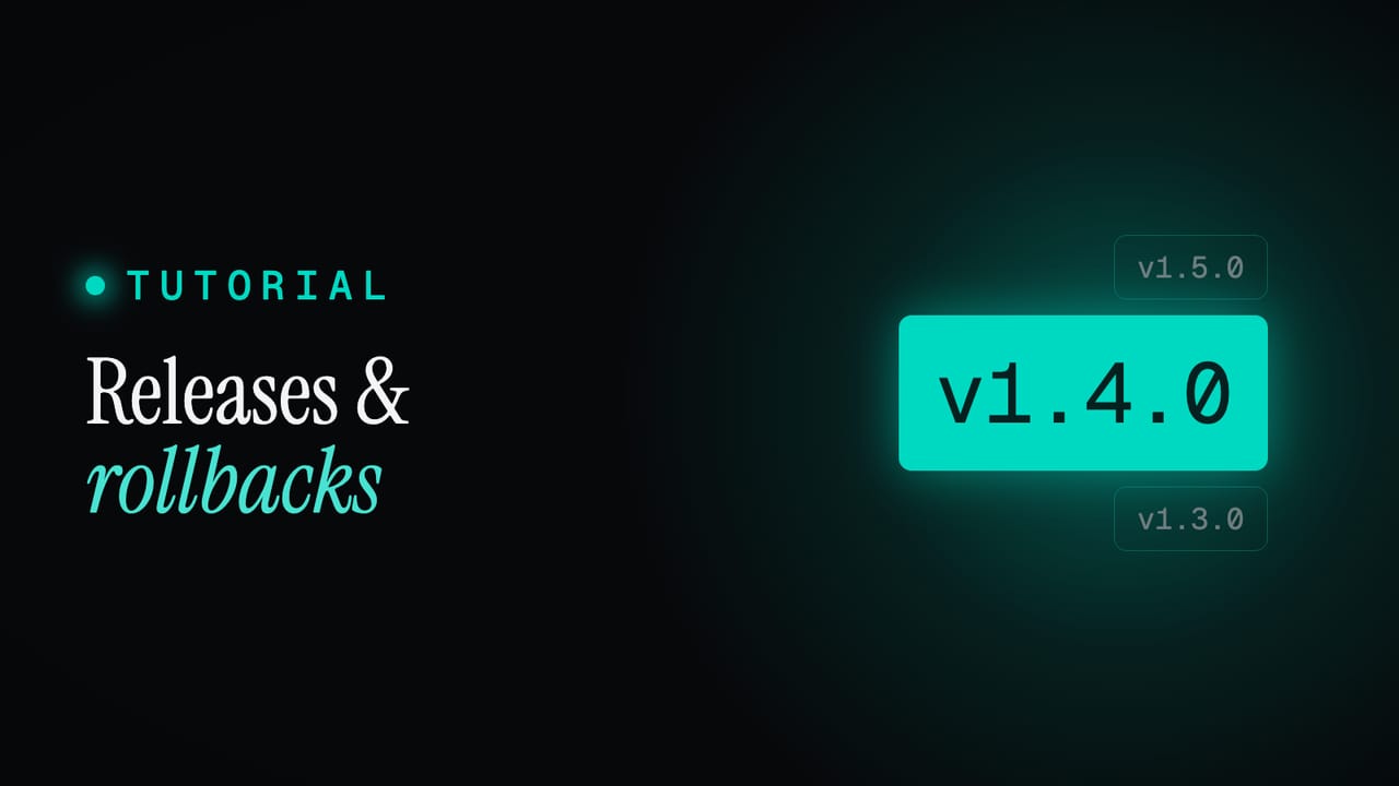
pnpm add @your-org/ui # or npm install / yarn addFrom here, updates work like any other dependency: bump the version and reinstall when you choose to. That deliberate, pinned upgrade path is the subject of versioned releases and rollbacks, so this guide assumes you are on a version and focuses on using it.
Wrap your app in the provider
There is one piece of setup: wrap the root of your app in the provider. It handles all the CSS for you, injecting and resolving every token, so anything rendered inside it can use your design system directly. On web you also import the fonts CSS once at the app root, which is what applies the @font-face rules.
// Web only: import once at the app root
import "@your-org/ui/fonts.css";

import { ZakladProvider } from "@your-org/ui";

function App() {
  return (
    <ZakladProvider>
      {/* your app */}
    </ZakladProvider>
  );
}
The provider works with no props and uses your default theme automatically. On paid tiers the provider name reflects your organisation, for example AcmeProvider, and the exact name plus a ready-to-copy snippet are generated into the README of every release, so you are never guessing. The full setup notes are under provider setup and fonts.
Components are namespaces
Components use namespaced variants, which means your editor hands you the full set of valid values as you type instead of leaving you to remember a list of string props. Each component doubles as its own namespace: the common variants hang directly off it, so the shorthand reads cleanly, and there is an enum for the cases where the variant is dynamic.
import { Button } from "@your-org/ui";

function Example() {
  return (
    <>
      {/* Shorthand: variant name directly on the component */}
      <Button.Primary onClick={() => save()}>Save changes</Button.Primary>

      {/* Or via the VARIANT enum for dynamic usage */}
      <Button variant={Button.VARIANT.Secondary} disabled onClick={() => cancel()}>
        Cancel
      </Button>
    </>
  );
}
Everything to do with a component lives on the component you import: its sub-components, its variant enum, and its prop types. One import gives you the whole surface, with nothing to hunt for in sub-packages.
import { Button } from "@your-org/ui";

Button.Primary            // sub-components
Button.Secondary
Button.VARIANT.Secondary  // variant enum for dynamic usage
Button.Props              // TypeScript types
The README in each release documents the available variants, props and usage per component. The reasoning and more examples are under using components.
Tokens, directly
When you need a value outside a component, on a custom element or a one-off layout, the tokens are exported too, from a single tokens export. Destructure what you need and apply it inline.
import { tokens } from "@your-org/ui";

const { color, spacing, foundation } = tokens;

function Card() {
  return (
    <div style={{
      color: color.text.default,
      padding: spacing.padding.default,
      borderColor: color.border.default,
    }}>
      Custom element
    </div>
  );
}
There is one distinction worth holding onto. color and spacing are semantic tokens: they resolve to live CSS variables, so they update automatically when the active theme changes, which is exactly why anything using them must render inside the provider. foundation gives you the raw palette values, which are theme-invariant plain literals and work anywhere. All of them are fully typed, and your editor shows the resolved default-theme value as a hint. The full guidance is under using tokens directly.
Switching themes
Every theme you have configured is exported as a member of a Themes enum, keyed by its slug. The enum contains exactly your themes and updates with every release, so your editor suggests the valid values and flags anything that is not a real theme at compile time. Pass one to the provider to set the app theme, or store it in state to switch at runtime.
import { ZakladProvider, Themes } from "@your-org/ui";

// Set a theme at the root — everything inside inherits it
<ZakladProvider theme={Themes.dark}>{/* ... */}</ZakladProvider>

// Or switch at runtime
const [activeTheme, setActiveTheme] = useState(Themes.light);

<ZakladProvider theme={activeTheme}>
  <button onClick={() => setActiveTheme(Themes.dark)}>Switch to dark</button>
</ZakladProvider>
To render one region in a different theme from the rest of the app, an inverted box, a dark hero, a preview card, wrap it in the singular <Theme> component and pass it a theme by name. Everything inside resolves to that theme regardless of the app theme, which is the clean way to do an always-dark section without hand-managing two sets of values.
import { ZakladProvider, Theme, Themes } from "@your-org/ui";

<ZakladProvider theme={Themes.light}>
  {/* this region is always dark, even though the app is light */}
  <Theme name={Themes.dark}>
    <Hero />
  </Theme>
</ZakladProvider>
How those themes are built in the first place, and how a child theme inherits from a parent, is covered under theme inheritance. On the consuming side, the reference is under switching themes.
Text and icons
Text styles ship as a namespaced Text component. Using <Text> with no variant is shorthand for <Text.BodyDefault>, and every text component is automatically responsive: font size, line height and spacing step with the active XS to XL tier unless you override it, the mechanism covered in responsive without breakpoints. The available names match the text styles configured in the Typography editor.
import { Text } from "@your-org/ui";

<Text>The quick brown fox.</Text>          {/* shorthand for Text.BodyDefault */}
<Text.BodySmall>Smaller body copy.</Text.BodySmall>
<Text.CaptionDefault>Helper caption</Text.CaptionDefault>
Icons live in the /icons subpath, and only the ones you actually use are bundled. Import the whole set as Icon and reference each by name, with an optional variant and size, or import individual icons for the smallest bundle. When the name is only known at runtime, for example from a CMS, reach for DynamicIcon, which opts into the full set and so does not tree-shake.
import * as Icon from "@your-org/ui/icons";

<Icon.ArrowRight />
<Icon.ChevronRight variant={Icon.VARIANT.Solid} size={Icon.SIZE.Large} />
<Button.Primary leadingIcon={Icon.ChevronRight.Solid}>Continue</Button.Primary>

// Data-driven names: opts into the full set, so it does not tree-shake
import { DynamicIcon } from "@your-org/ui/icons";
<DynamicIcon name={iconName} size={Icon.SIZE.Medium} />
The full references are under text styles and icons, and the design thinking behind the icon set is in one icon system.
The same code, web and native
The package is platform-neutral from the ground up. Components are authored against a shared API with platform-specific implementations behind it: on web they render HTML with CSS custom properties, on React Native they use StyleSheet values resolved from the same token set. One token vocabulary drives both, so there are no separate imports and no conditional platform code in your app.
// One import, same component API — on web and React Native
import { Button } from "@your-org/ui";
Web is fully supported through the package's browser and neutral builds, for React SPAs and SSR alike. React Native and Expo are supported through a dedicated native build and a react-native export condition, so Metro resolves the native bundle automatically. On a native project you install the two native peers the package leaves to you, then wrap your app in the generated provider exactly as on web.
# Expo
npx expo install react-native-svg expo-font

# Bare React Native
npm install react-native-svg expo-font
On native the provider calls loadFonts() on mount and gates render on the result, so your fonts register through expo-font automatically, with text falling back to system fonts until loading completes. The web bundle is untouched and behaves exactly as before. The full cross-platform notes are under cross-platform.
That is the whole onboarding: one install, one provider, then components, tokens, text, icons and themes all reached through a typed API your editor completes for you, on web and native from the same code. Because it is generated from the live system and pinned to a version, what you build against is exactly what was designed. Start a project and publish a release to get your package, or read the developer docs for the full reference.