Tutorial
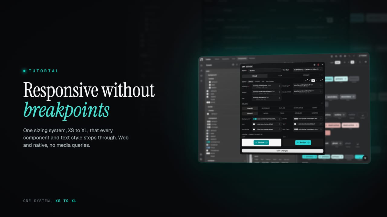
Responsive without breakpoints: the XS to XL sizing system
Most responsive work is a pile of breakpoints scattered through the code, redone for every component and again for every platform. Zaklad replaces it with one fixed mechanism: a set of sizing tiers from XS to XL that every text style and component steps through together. Here is how it works, and why it covers the web and native at once.
Responsive design rarely fails because the idea is hard. It fails because the work is scattered. A media query here, a slightly different one there, a component that was made responsive last spring and another that never was, and a separate set of rules again the moment the same system has to run on native. Every breakpoint is a small decision, and there are hundreds of them, each made in isolation. The result reads as almost-consistent, which is the worst kind, and there is no single place to change how the whole thing scales.
Zaklad takes the breakpoints out of your components and turns sizing into one system. Every text style and every component carries a size for each of five tiers, from XS up to XL, and the active tier is chosen for the surface it is rendering on. You design and build against a role, Heading / H1 or a button's padding, and the right size for the context is resolved for you. This guide walks through what a tier is, how you author per-tier sizing, and why the same mechanism covers the web and native without a second system.
TL;DR
- Sizing runs through five fixed tiers, XS to XL. They are a part of the platform you do not configure away.
- A tier is not a viewport width. It describes the density and spatial intent of a surface, which is what lets one system cover smartwatch to 4K and web to native alike.
- Text styles and components carry a set of dimension tokens per tier, so font size, line height, spacing and icon size all step together as the tier changes.
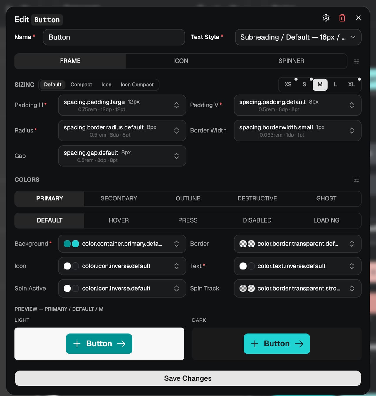
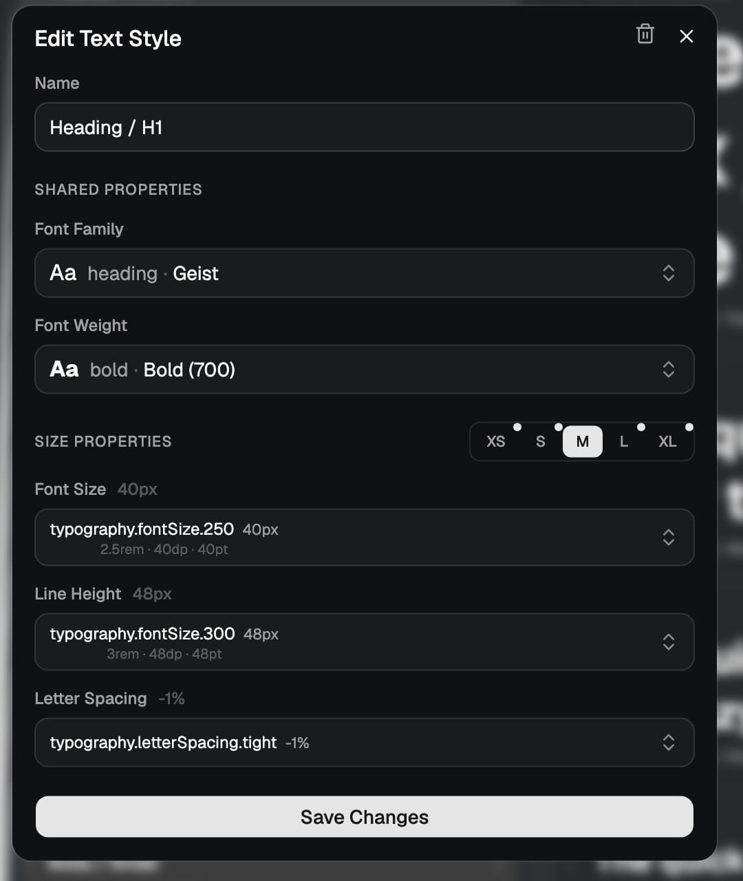
- You author from the middle out: set the M tier and the others take the same selection, then override only the tiers you want to differ.
- On the web the provider maps viewport width to a tier automatically; on React Native you supply the active tier. You can also lock a product to a subset of tiers.
What this covers
- Tiers, not breakpoints
- The five tiers
- Set the middle, adjust the edges
- Sizes that step together
- One system, web and native
Tiers, not breakpoints
A breakpoint is a pixel width at which the layout is allowed to change. It is a low-level fact about a browser window, and it has two problems. The first is that you end up restating it everywhere, because every component that wants to respond has to know the same numbers. The second is that it only means anything on the web. A phone app does not have a viewport you query the same way, and a watch face is not a narrow browser, so the whole approach has to be rebuilt the moment you leave the page.
A tier is a level up from that. It does not describe a width, it describes the density and spatial intent of the surface you are rendering on: how much room there is, and how tightly things should sit. XS is an extremely space-constrained surface; XL is a generous one. Because a tier is about intent rather than pixels, the same five of them describe every device class there is, and the same sizing decisions apply whether the surface is a browser window or a native screen. That is the whole reason the system is one system and not two.
The five tiers
There are five tiers, and they are fixed. You do not add or remove them, which is what makes them a reliable vocabulary across a whole system and across every output it produces. They run from the most constrained surface to the most generous:
- XS — IoT, smartwatch and extremely space-constrained surfaces.
- S — phone-sized interfaces, where density matters.
- M — tablet or compact desktop.
- L — standard desktop.
- XL — large desktop and 4K displays.
You are never forced to use all five. A product can be locked to the tiers it actually ships on: only XS for a smartwatch, XS to S for a mobile-only app, or the full spread for a responsive web app. The tiers you do not use simply do not come into play. What stays constant is the names, so a size defined for M means the same thing in every text style, every component, Figma and code.
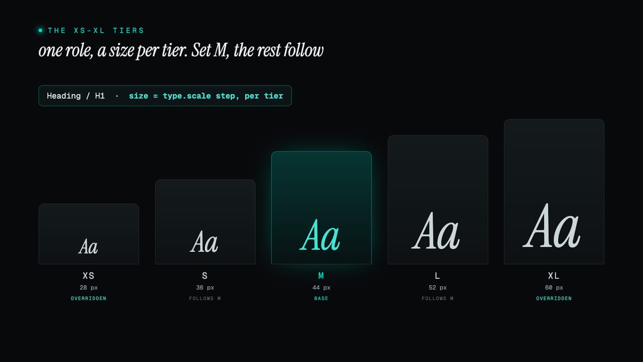
Set the middle, adjust the edges
The fear with per-tier sizing is that it is five times the work: five numbers for every property of every component. It is not, because you author from the middle out. When you size a component, you set the value on the M tier first, and every other tier takes that same selection. At that point the component is already responsive in the trivial sense, the same size everywhere, and you have made one decision rather than five.
From there you override only what should differ. Tighten the padding on XS, step the size up on XL, and leave the tiers in between alone. The editor marks the tiers you have changed, so it is always clear at a glance which sizes are deliberate variations and which are still following the middle. Most components need a couple of overrides at the ends and nothing in the middle, so the real cost is small and entirely under your control.
Because a component's per-tier sizes are token selections rather than raw numbers, the same change-once logic from the three token layers applies here too. A tier points at a dimension token, the dimension token derives from a single base, and adjusting the base reflows every tier of every component at once. The practical side of all this lives under breakpoints in the developer docs.
Sizes that step together
A tier does not move one value, it moves a set. Text styles and components each carry a group of dimension tokens per tier, so as the active tier changes, font size, line height, spacing and icon size all step up or down together. This matters because the things that make a layout feel right at a given density are related: a larger heading wants more line height and a little more room around it, and an icon next to it should grow to match. Tying them to the same tier keeps that relationship intact instead of leaving you to remember it by hand in four places.
Text styles get this for free. A single style, Heading / H1, holds a size for each tier, so the same role is comfortable on a phone and on a wide screen with no separate mobile style and no breakpoint overrides in the markup. The role stays one thing and simply resolves smaller on a narrow tier and larger on a wide one. The full picture for type is covered under text styles; the underlying maths that makes one base drive every step is covered under dimension calculations.
One system, web and native
Because a tier is an intent rather than a width, the same set drives the web and native without a second system underneath. The difference is only in how the active tier is decided. On the web, the provider maps viewport width to a tier for you, out of a set of sensible default breakpoints you can override if you need to. You treat the tiers like CSS breakpoints, let the container width pick the tier, and never write a media query in a component again.
On React Native there is no viewport to query, so you supply the active tier directly, which is exactly the control you want when a screen's density is a product decision rather than a function of window size. Either way the components and text styles are identical, drawn from the same token set, with no per-platform import and no conditional code in your app. The cross-platform detail is in the developer docs, and the reasoning behind the whole model is under the XS to XL sizing context.
Put together, that is responsive design without the breakpoints: five fixed tiers that describe intent rather than pixels, sizes that step together as a set, authored from the middle out, and one mechanism that covers every device class and both platforms. You build against the role and the right size for the context is chosen for you. Start a project and open the typography or components editor, or read the XS to XL sizing context for the full reference.