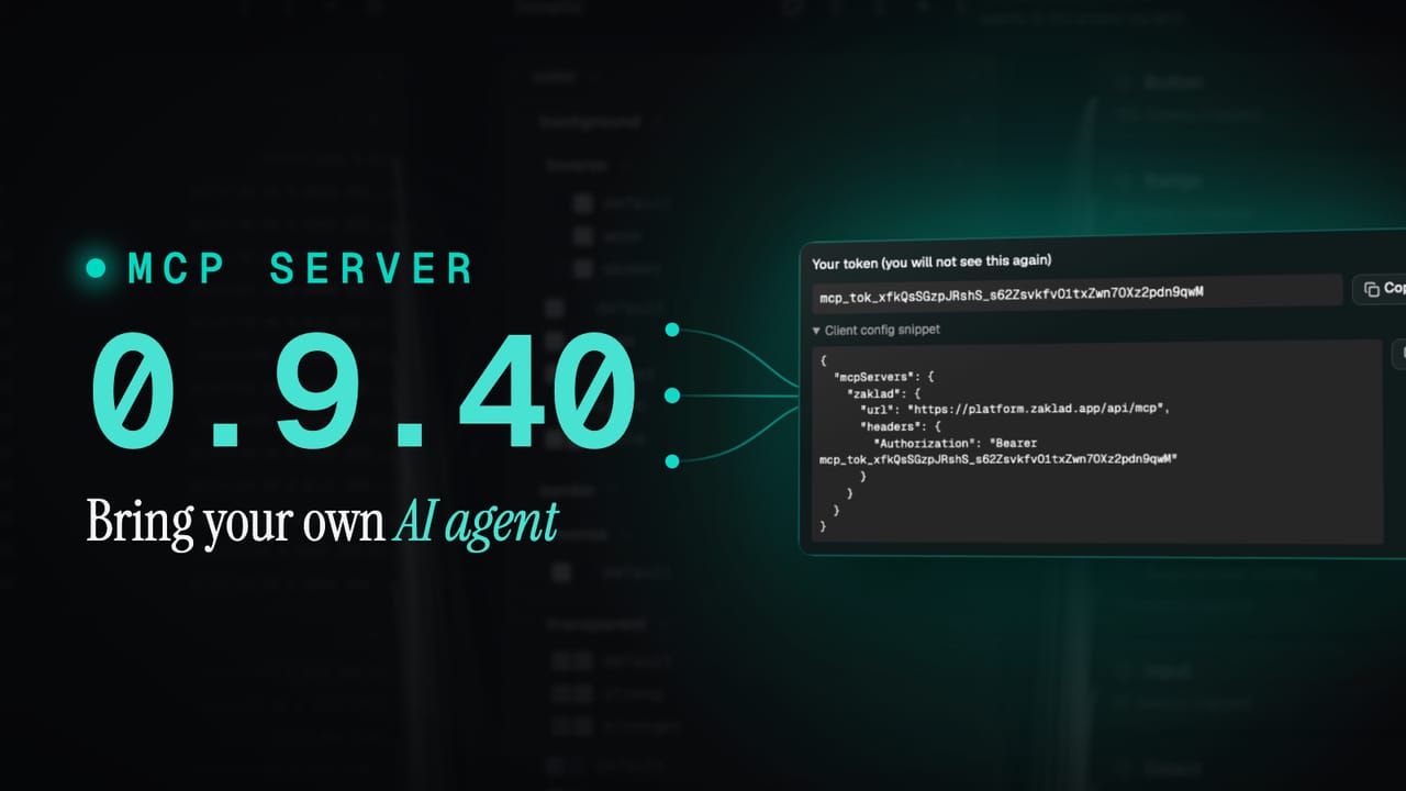
Update
What's new in 0.9.50: power tools, and a cleaner way in
0.9.50 gives every foundation type a guided builder, each with a Simple and Advanced mode, and hands your AI agent the very same tools over MCP, so you can build by hand or by instruction. It also brings new motion, gradient and shadow tokens, and a top to bottom refresh of the whole interface.
Since 0.9.40 opened zaklad up to AI, this release rebuilds how you create: faster ways in, the same power whether you work by hand or through your agent, more kinds of token, and an interface that has grown up across the board. It is also a landmark build. Release 0.9.50 is fifty steps in, and it is the biggest batch yet.
What's new at a glance
- Guided builders. Every foundation type now has a builder, each with a Simple mode and a full Advanced mode, switching losslessly.
- The same power over MCP. Every builder is also a tool your AI agent can call, so you choose how you use it. The server has grown from 46 to 80 tools.
- More token types. Unitless numbers, durations, easing curves, stroke styles, and composite shadows, gradients, borders, transitions and blur.
- Motion as a first-class token. A Motion Builder turns a Speed and Easing choice into a complete, code-ready ramp.
- A cleaner interface, end to end. A full audit of the whole app for clarity and consistency, from the wizard to the editor, plus a batch of fixes.
A cleaner way in (the builders)
The connective thread through this release is the builder system. Every foundation type now has a dedicated builder, and each one has two modes: Simple (a handful of choices, enough to produce a solid result straight away) and Advanced (full granular control over every parameter). Switching between them is lossless, so you can start simple and refine without starting over. Easy for someone new to tokens, and full depth for someone who wants it.
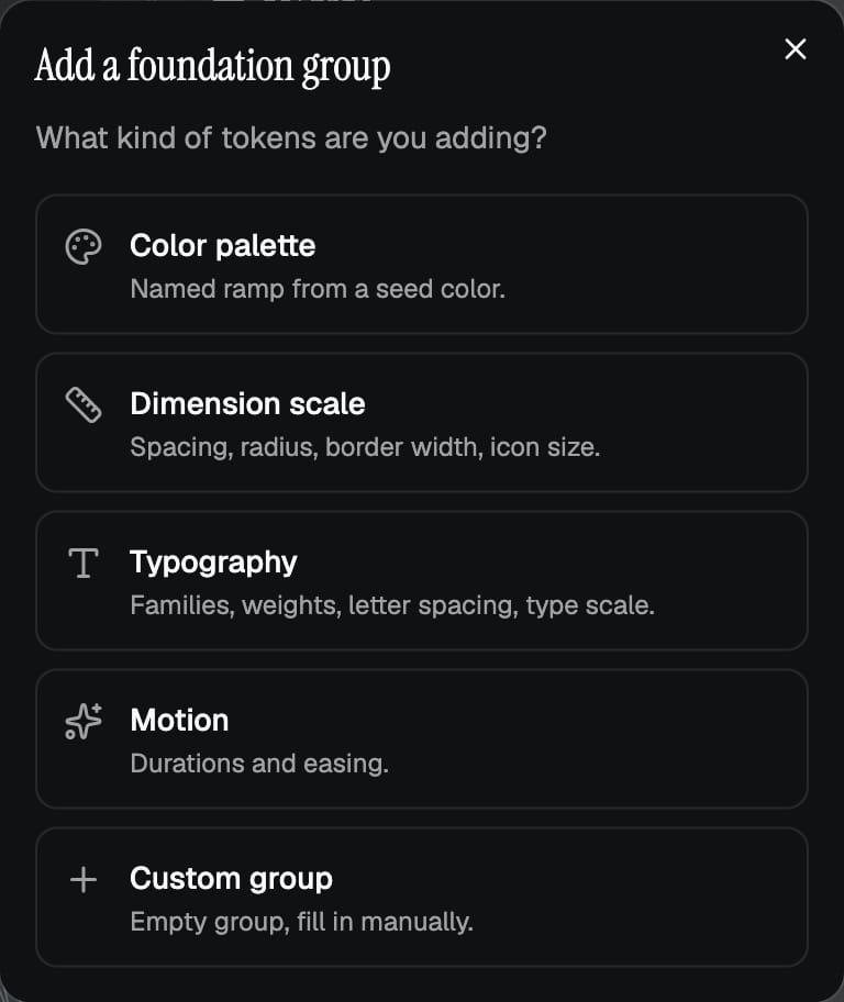
It starts at the point of adding a group. Instead of a blank form, you now get a type picker: Colour, Dimension, Typography, Motion or Custom. Pick the type and you land in the right builder immediately.
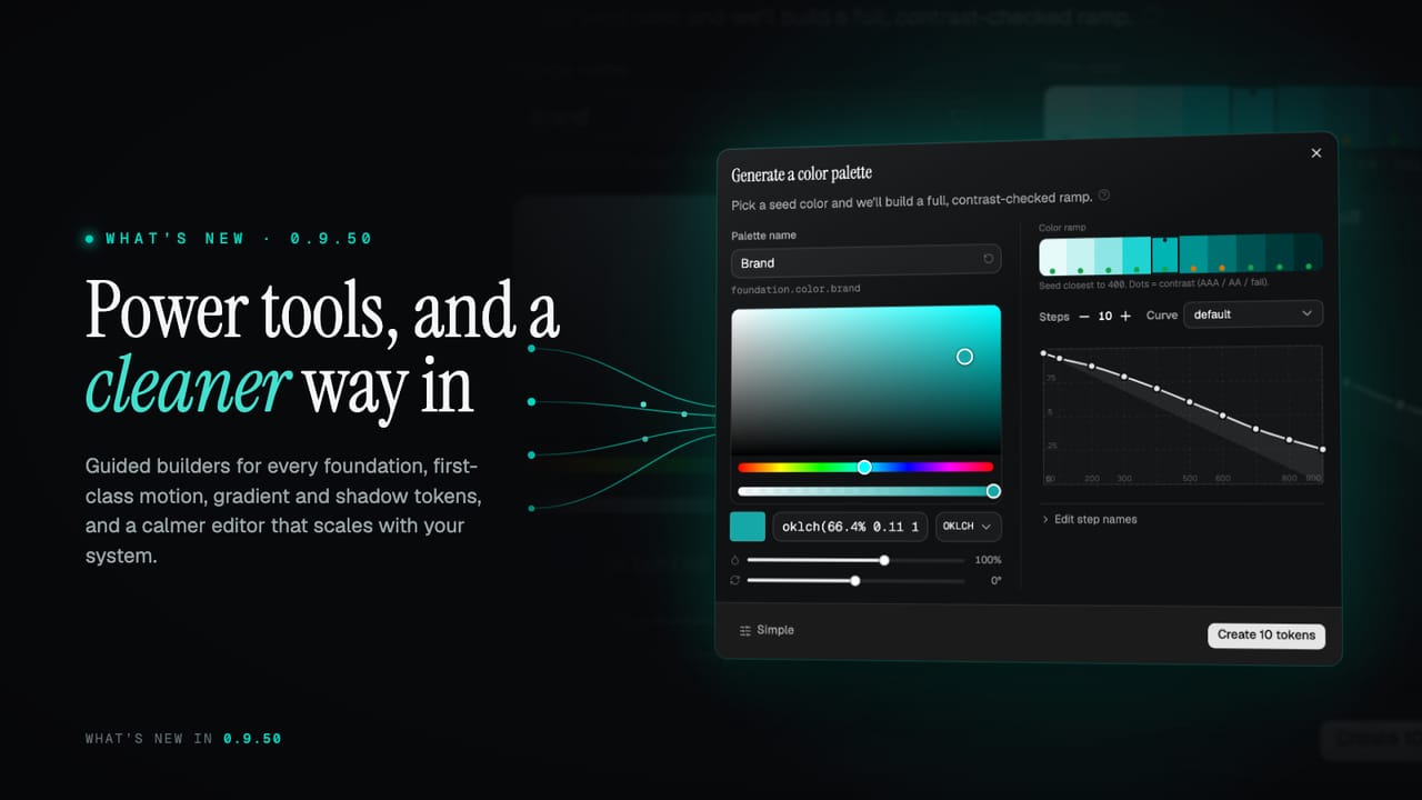
The Palette Builder takes a seed colour in any format, OKLCH, HSL, RGBA or HEX, and generates a ten-step palette. You can reshape the ramp on a draggable lightness and chroma curve, or pick from preset curve families. Live swatches show contrast scores as you adjust. One modal now handles both creating and editing a palette.
The Dimension Scale Builder generates spacing, radius, border-width and icon-size scales from a maths model: linear, modular, golden ratio or Fibonacci. You can optionally wire a master sizing control so one value reshapes the whole scale later. A live preview shows pixel values and the underlying expression side by side. Advanced mode adds step count, a naming scheme, and the master sizing wiring.
The Typography Builder covers font families with fallbacks, a weight ramp, letter-spacing and line-height, and a size scale, all as tokens. Rather than starting from a blank text style, the Text Style Wizard generates a named set of headings, body, code and caption styles, along with the tokens under them, in one step. It supports optional per-breakpoint responsive sizing and spots name collisions so you can skip or rename before anything is written. The "+" on text styles now presents a clear fork: "Generate a set" (the guided path) or "Add a custom style" (the manual path), sitting side by side.
The same power, over MCP
Here is the part that ties the release together. Every builder you just saw is also a tool over MCP. We built the power tools once and gave you two ways to reach them: a guided interface when you want to see and shape things yourself, and your AI agent when you would rather describe the outcome and have it done. Use either, or both, on the same project. 0.9.40 let an agent read and change your system. 0.9.50 hands it the full set of build tools, growing the MCP server from 46 to 80 tools.
- Scaffold a whole system from a brief. Tokens, light and dark themes, component templates, text styles and a starter icon set, all in one step, all reversible back to empty.
- The same generators that power the builders. Palettes (including neutral, status and translucent sets), dimension scales, typography and motion, driven by the same engines as the interface. Plus plain-language design adjustments, things like roundness, spacing density, surface contrast, shadow depth and colour intensity, that remap many tokens at once.
- Contrast tools. Read the accessibility report per theme and correct failing pairs directly.
- Full create, edit and delete over MCP for components, text styles and icons, including importing a bundled icon set, not just tokens.
- Cut a release over MCP. A validate step returns a one-time token, then a confirmed create step publishes it. Failed builds can be retried without burning the version number.
- A machine-readable manifest. Describes your components with their import paths, exact variants and props, and which token drives each part, for code generation and downstream tooling.
you  "give me a calmer, rounder starting system for a wellbeing brand"
claude  reading project structure · planning scaffold
claude  → scaffold: soft neutral palette, rounded radius scale, low-depth shadow set, a gentle motion set
zaklad ✓ system scaffolded · tokens, two themes, component templates and a starter icon set
zaklad ✓ adjustment applied · rounder corners, calmer spacing, lower shadow depth
claude  all changes land as one undoable step · your history is kept separate from the agent's
Every change still lands as one undoable step, with a dry-run option, safe limits on bulk edits, and the agent's undo history kept separate from yours.
More kinds of token
zaklad now covers the parts a real system needs, as first-class token types. New primitive value types include unitless numbers, durations, easing curves and stroke styles.
On top of those, a new set of composite tokens covers shadows, gradients, borders, transitions and blur, each with an inline editor so you can create and edit in place. Previously you had to delete and recreate a composite to change it. Auto-generated composites show a rich read-only preview of their constituent parts.
Motion is now a real token type. The Motion Builder generates a complete motion system from two inputs: a Speed and an Easing choice. The output is a duration ramp, directional easing curves (in, out, in-out), and ready-made transition tokens. A live showcase plays each curve so you can feel the rhythm of the system before committing.
It all carries through to output. Code generation emits typed maps for shadows, gradients and animations, theme-aware and reduced-motion aware, and produces nothing at all when a project has none. Figma sync maps shadows to effect styles, gradients to paint styles, and borders to variable-linked strokes. The standard design-token (DTCG) export round-trips all of these accurately.
A cleaner interface, top to bottom
This is also the release where the interface grows up. We went through the whole app, start to finish, tightening clarity and consistency and fine-tuning the details on every screen. The design system wizard, the token editor, the settings, the empty states, and the overall look and feel all had a pass. It moves zaklad on from its MVP beginnings into something that feels finished to work in, whether it is your first system or your fiftieth.
Connection lines now have three modes: All, Focus and Off. In Focus, reference lines stay out of the way until you hover a token, then the whole dependency chain lights up. In a dense system this makes it straightforward to trace what depends on what, without the canvas becoming noise.
Broken references are no longer silent. A token whose target was deleted now shows an amber warning on the row, and the edit modal explains exactly which reference to fix.
Project settings were rebuilt. Each field saves on its own, with no global Save button to forget. The cover image is now a drop zone. A new naming-convention setting lets you choose camelCase or kebab-case, and that choice flows through everything the builders generate.
Theme mappings now apply on Save and discard on close, so you can try a mapping without committing it by accident. The release also brings in-app documentation search, a segmented two-factor code input, collapsible font families, and calmer empty states across the app.
And a round of fixes
Underneath all of that, a large batch of fixes across the app, and more accurate exports: font weight, durations, gradients and composite tokens now export correctly.
The docs have been updated for everything in this release. Whether you start from a builder, a template, or your AI agent, the right path is one step away.