Update
What's new in 0.9.3: start from a wizard or a base template
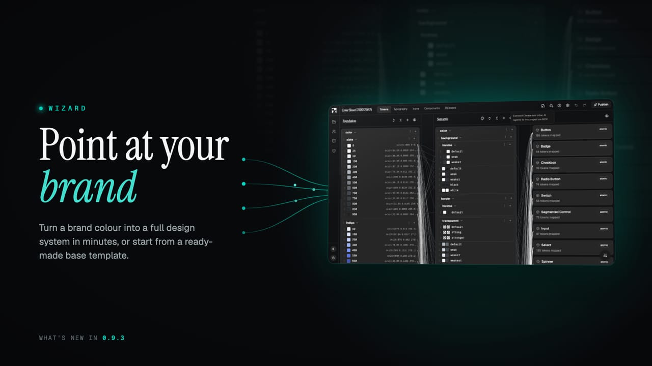
0.9.3 gives you two fast ways to begin. Point the wizard at your brand and it builds a full system you can fine-tune, or start from a production-ready base template. Plus more components and a round of fixes.
A blank project is the right starting point when you know exactly what you want. Most of the time you do not, you just want something real on the screen to react to. 0.9.3 adds two faster ways in: a wizard that builds a whole system from your brand, and a base template that is ready to use out of the box.
What's new at a glance
- The wizard. Point it at your brand and get a full system in minutes.
- A base template. A production-ready starter system you can build straight onto.
- Three ways to begin. Wizard, template, or a blank project, your choice.
- More components. Another batch of components in the library.
- Fixes and polish. Smoother flows and a round of bug fixes.
Point at your brand, get a system
The wizard takes you from a brand to a working design system in two steps. It is easy enough that you can start with a single colour, and powerful enough that a specialist can drive every detail by hand. You begin however suits you: add your brand colours, import them, or pick a style direction first and refine from there.
In Brand Setup you give it your raw materials. The first colour becomes your primary, and you can add the rest and set their roles. Choose your display, body and mono fonts, nudge a style direction, and it gets to work: building full palettes from your colours, mapping them onto a complete token layer, and deriving light and dark themes.
Then tune the feel
The second step is the Fine-Tune studio, and it is where the system gets its character. A handful of plain-language sliders move the whole thing at once, with a live preview of real components in light and dark next to them:
- Roundness takes every corner from sharp and squared to a soft pill.
- Spacing density moves the whole UI between compact and roomy.
- Surface contrast sets how strongly layers and borders separate.
- Shadow depth lifts cards, menus and dialogs off the page, or keeps them flat.
- Chroma dials the saturation of the palette up or down.
That is the easy path covered. Underneath, the detail is all there for anyone who wants it: per-colour hue offsets, custom lightness curves, the type scale ratio, and direct overrides on any token. Undo and redo cover the lot while you explore. When it feels right, Create my design system turns the whole thing into real tokens, themes and components you can keep editing.
Or start from a base template
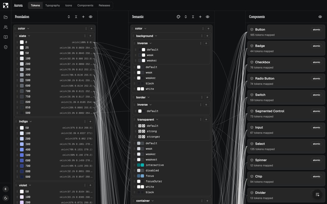
Sometimes you do not want to make any decisions yet, you just want a sound system to build on. The new base template is exactly that: a minimal, production-ready design system with OKLCH colour palettes, a full semantic token layer, light and dark themes, sensible typography and a set of example components. Start from it, then make it yours, instead of facing an empty project.
Between the three, there is now a way in for every situation: the wizard when you want a head start from your brand, the template when you want a solid default, and a blank project when you know exactly what you are building.
More components and fixes
The library picked up more components this release, filling in more of the structural and overlay pieces, including a table, a drawer, a dropdown menu and a breadcrumb. As always they are token-driven, so they inherit whatever your wizard or template set up. Alongside them is a round of smaller fixes and flow improvements across the editor.
See the features page for the full picture, or jump to pricing to get started. More lands shortly.