Tutorials and product updates
Deep dives, how-tos, and what's new, from the team building Zaklad.
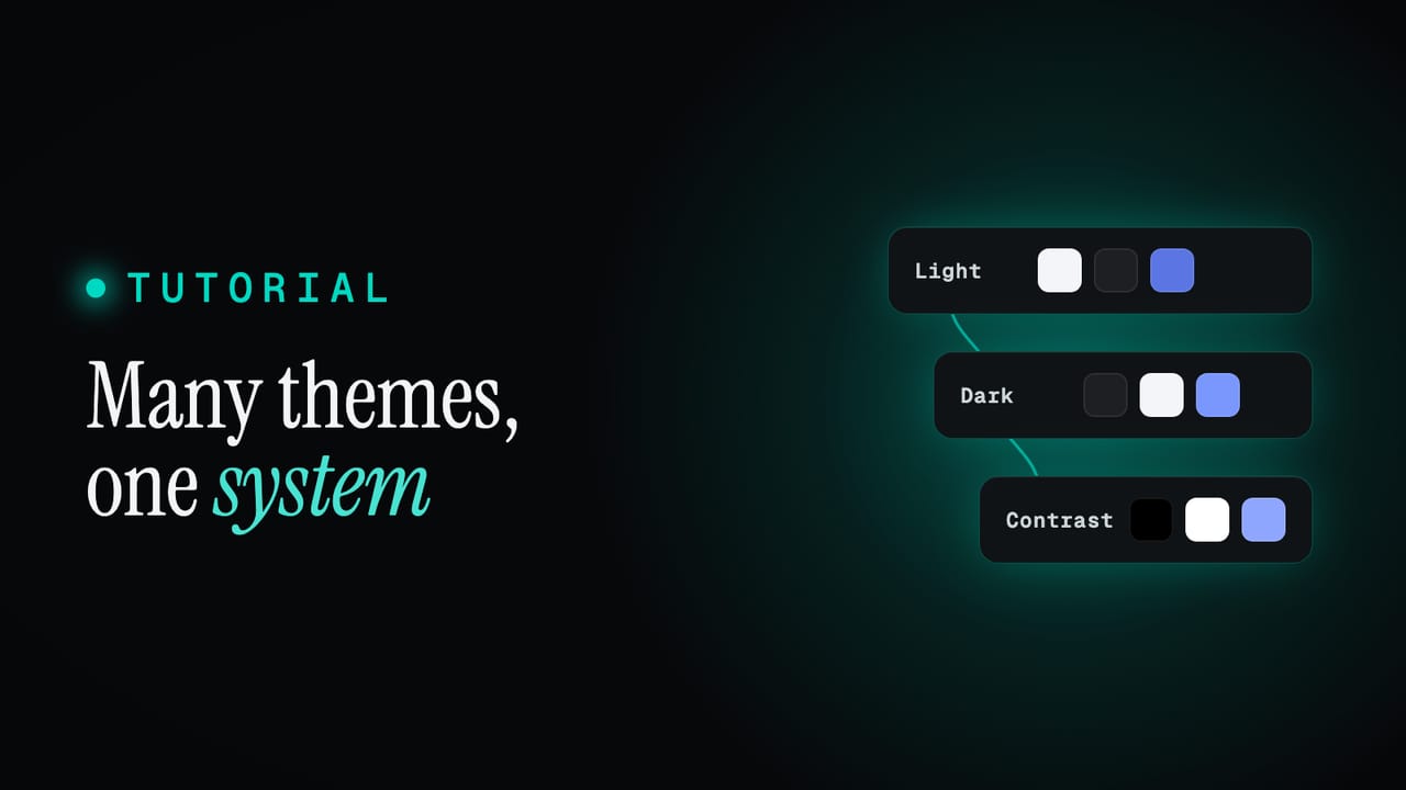
Themes and modes: build as many as you like, maintain one system
Light, dark, high contrast, a brand variant. Most teams keep each theme as a separate copy that quietly drifts. Zaklad models themes as one system whose variants inherit from each other, so each theme holds only what makes it different. Here is how semantic tokens carry the theme, how the inheritance works, how to switch and add themes, and what a theme becomes in Figma and in code.
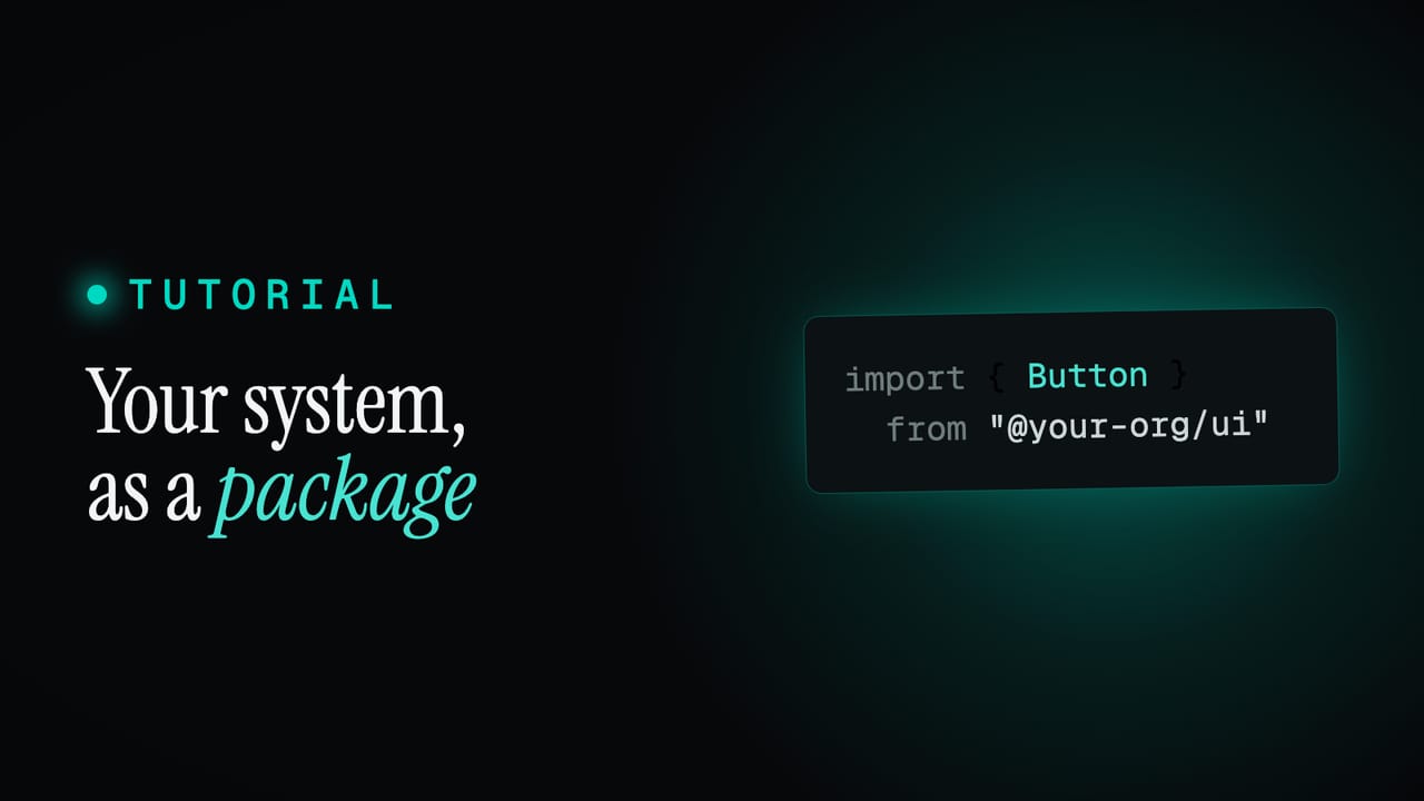
Consuming the package: install, provider, components, themes, web and native
A Zaklad release ships as a generated npm package: one provider to wrap your app, components with a namespaced API your IDE completes for you, tokens you can read directly, compile-checked theme switching, and the same code running on web and React Native. Here is the whole developer onboarding, start to finish.
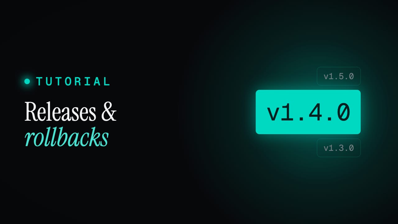
Versioned releases and rollbacks: how one publish freezes your whole system
A live design system is a moving target, which is fine while you build and a problem the moment a team depends on it. A release freezes the whole system at a version, ships that exact state to code, Figma and a token export at once, and never moves again. Here is how immutable snapshots work, and why a rollback is just a version number.
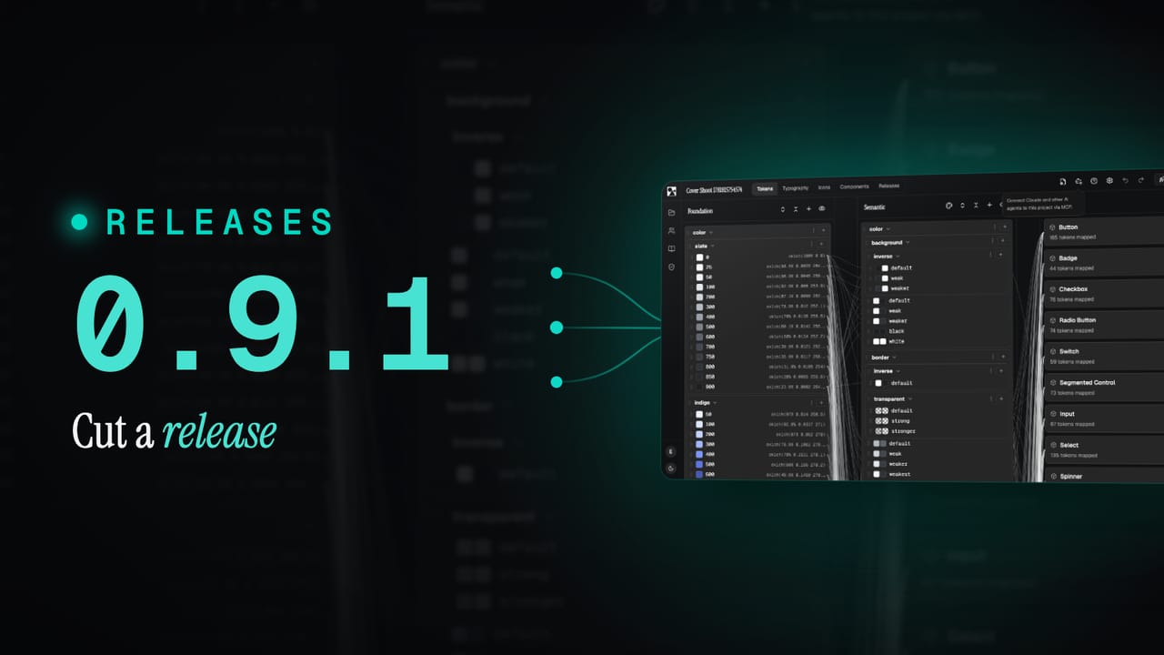
What's new in 0.9.1: ship your system as versioned releases
0.9.1 turns your design system into something you can version and ship. Cut a release, freeze the whole system at that version, and let Figma and code pull it on their own schedule. Plus a batch of new components and a round of UI polish.
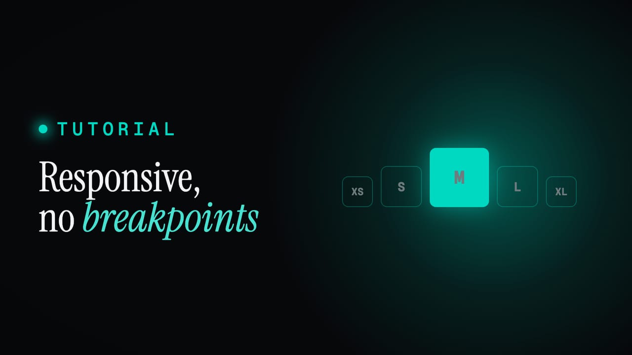
Responsive without breakpoints: the XS to XL sizing system
Most responsive work is a pile of breakpoints scattered through the code, redone for every component and again for every platform. Zaklad replaces it with one fixed mechanism: a set of sizing tiers from XS to XL that every text style and component steps through together. Here is how it works, and why it covers the web and native at once.
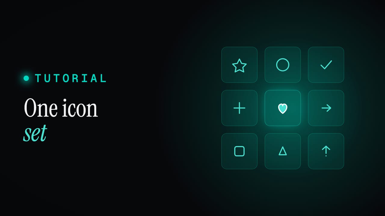
One icon system: many libraries, unified variants, in code and Figma
Icons are where consistency quietly breaks: two libraries with different names, mismatched variants, and a design set that drifts from the coded one. Here is how to pull any number of icon libraries behind one consistent API, unify their variants, and keep code and Figma in step.
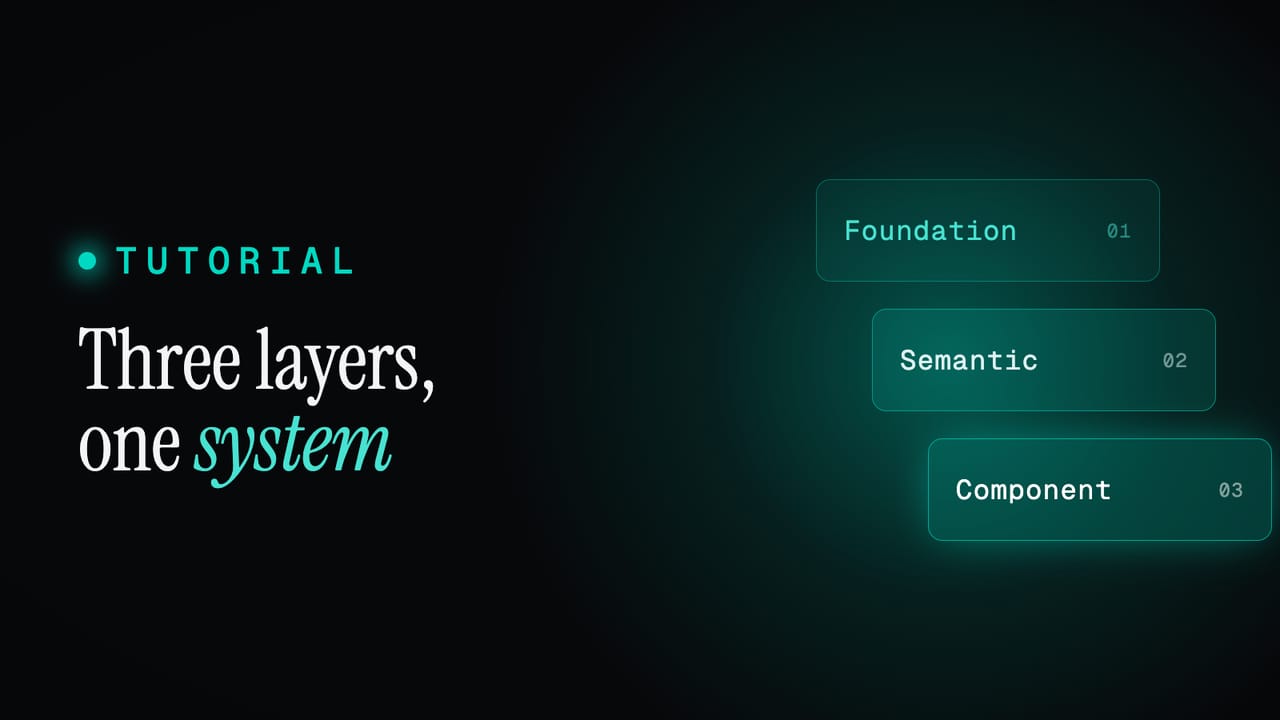
Three token layers: how a design system changes cleanly
A design system is not a pile of values, it is three layers that build on each other. Here is how foundation, semantic and component tokens fit together, why a semantic token points at a value instead of holding one, and why that single decision is what lets a whole system change without breaking.